Quantcast
Channel: jackie simmonds artyfacts
Viewing all 152 articles
Browse latest View live

BIRDS- OLD DRAWINGS, NEW STORY

$
0
0

I had a visitor this weekend; a marvellous Israeli Professor who is passionate about birds and has initiated some wonderful projects worldwide - not the least of which is a project teaching farmers how to use owls instead of pesticides!  The owls remove rats and mice from the fields, and his owl nesting boxes are now being used by many grateful farmers, and at the same time, he is promoting peace between neighbours... for example, he has encouraged Arab farmers, who were previously superstitious about owls and thought that they brought bad luck, to try the owl nesting boxes - with huge success. A marvellous bit of cooperation between Israelis and Arabs - we rarely hear about these kinds of collaborations, they are not as newsworthy as bombs and battles!
 As a result of his visit,  I suddenly remembered that somewhere in my studio, there was a calendar I had produced as a student. I  found it, and thought I would just quickly show you some of the birds I tackled at that time, more than thirty years ago!!!  One is a watercolour -( I doubt I could paint such an image quite as well today - who was that person then??? I work so differently today.  But doesn't he look SOFT!!  Owls actually are really soft to the touch, I have stroked one.  It didn't mind at all!) the rest are drawings done with carbon pencils. I hope you enjoy them.

Long-eared, and Short-eared owls

Cuckoo Owlets


Barred Owls


Young Tawny Owl


SPREADING MY WINGS

$
0
0
Last week, I showed you some of my owl drawings from 30+ years ago.  This week, I thought I would show you some of the images I have been creating for my OPEN GARDEN day, June 16. when my garden will be open to the public for the day, and I will be showing not just the lovely garden, but also some of my work - paintings, garden ceramics, and enamelled items.

Amongst the paintings will be images of some of the little birds which visit British gardens regularly at all times of year.  I am fascinated by the wildlife in my garden ...we have birds galore, including majestic herons - beautiful to look at but not my favourite visitors since they come to eat my fish;  we have badgers, foxes, neighbourhood cats, and we even had a visit from Mr and Mrs Duck last week!

Here are a few of the small paintings of little birds ...not detailed botanical images, but friendly fluffy ones!

"White Waistcoat"  - a rather splendid chap, don't you think?


This one is called "Chilly Feet" and is obviously a Robin.  I know the event is called "Midsummer Gardens" but actually, they have had snow in the north this month!  And Robins are with us all year round.


This is one of my favourites...a cute Long Tailed Tit balancing somewhat precariously on a stump- I called it "Strong Grip".

I will not only have the paintings for sale, but also greetings cards.  There will be approximately 20 different bird images - they would look good on the wall in sets of four!

I have also been working on local woodland scenes:


"Bluebell Patch", pastel, 6"x6"  I just so love carpets of bluebells.

This one is slightly larger, framed in a modern white "box" frame, about 11"x11".. It is the bridle path in Mad Bess Woods - locals should recognise it.  I do feel lucky to have these gorgeous woods so close to my home.


Another small one, this time with hints of abstraction and a strong colour palette, it is called "Silver Birch Sentinels":


Finally, I thought I would show you this one;  it is loosely based on the woods, but it is a foray, for me, even further into the world of abstraction.  I had all ready been gently pushing the colour, using my own colour palette rather than the literal colour of the scene...today I decided to break out of my comfort zone, and for the sheer fun of it use REALLY experimental colour.  It was very exciting to produce, even if it is never framed!


If you would like to come and see the garden, tickets are available from the MIDSUMMER GARDENS website.  the ticket will give you the chance to see lots of gardens throughout the weekend,  and all proceeds will go to charity.  Your ticket will also go into a draw for a variety of excellent prizes.


Most gardens will be open both Saturday and Sunday;  I will be open Sunday only.  If you live in the vicinity, (Greater London, Herts, Bucks, Middx - Ruislip, Northwood, Rickmansworth, Pinner) do pop along.  If you need directions, you can send me an email to jackiesdesk@gmail.com


Savannah in the undergrowth.  She hides here to watch the birds.


SUGGESTION = POETRY

$
0
0
I recently read this quote, from artist Dwight William Tryon:

"The less imitation, the more suggestion, and hence, more poetry".

I love this idea.  It could almost be MY artist's statement.  What I really would like to achieve with my work.  More suggestion, and hence more poetry.

I have long felt this way, but have always found it hard to break away from the "tyranny" of the subject.  I do occasionally achieve it...but it is certainly not easy.  I have to allow myself to "freewheel" when painting, trusting that knowledge gained over many years will assert itself and the image will have a strength based not on the accuracy of the subject-matter, but on my choices for suggestion together with the elements of design and composition which help to give the image a little magic.  A little poetry.  Words, on their own, are not particularly special - they are just individual words, as in the pages of a dictionary.    But the poet will take ordinary words and weave them together in such a way that they stimulate imagination, and create visual images in the mind.  The painter, I believe, needs to do this with marks, marks which, in themselves, are not special, but can be put together in a special way.

Degas said:  A painting requires a little mystery, some vagueness, some fantasy. When you always make your meaning perfectly plain you end up boring people. 

and he said:

A picture is an artificial work, outside nature. It calls for as much cunning as the commission of a crime.

Here is another of my little bird images.  Notice how the angles of the bird are echoed by the angles of the branch. This was not in the original reference material, I created it deliberately.  (perhaps even cunningly.....).   Notice how the foliage really is just marks which suggest leaves.  YOU, the viewer,  turns those marks into leaves.   


"Quizzical Sparrow" SOLD


The woodland scene at the top of this post also falls into the "suggestion" category.  It is not a real scene.  The colours are not real, they were chosen to suggest a cool spring day, with crisp, clear light (Spring here in the UK this May is very, very chilly this year).

If I can occasionally achieve my goal of "a little more poetry" - then I feel I am on the right road.


STOP PRESS


There has been lots of interest in my little bird pictures.  If you would like to see photos of the paintings, with a view to owning one for yourself, just contact me by email to jackiesdesk at gmail.com, for availability, prices and postage costs.

As well as the original paintings, I have a variety of greetings cards of my birds, and can send you examples of the available images.  I am selling 6 for the price of 5.  The cost will depend on your location.
Here are four of the eight I have printed:


APOLOGIES FOR ABSENCE

$
0
0
So sorry, dear readers.  I have been working full pelt to complete work for my one day Open Garden event. I know this sounds daft, but when I tell you that the Midsummer Gardens website has had more than 12000 hits, and that I may achieve several hundred visitors in one day, you can perhaps understand.  Of course, there are no guarantees, but like a good boy scout, I believe in being prepared!

One of the nice things about the day is that all ticket proceeds go to charity, and to add to the fun, I am organising a "secret auction" - I am hoping that people will put sealed bids into an envelope, and the highest bidder will win my painting, ALL proceeds to charity.  Here it i, below,  you can join in too if you wish!  Just send me an email with a bid. (Has to be over $200 - it is quite a large painting.) Not only might you win a painting, you will also have the satisfaction of knowing that your money will go to a very good cause, rather than into my pocket!!!    It is called "Tucked Away", and was painted on the spot in a quiet Majorcan garden, in the sunshine.


I will be back to writing more "useful" posts once I am back in harness, which will be after June 16.  I have other commitments between now and then too, which makes matters even worse.

I hope you are all enjoying June 2013.


OPEN GARDEN REPORT

$
0
0


The rain came, but so did the people, and the image above did finally go to the charity for a goodly sum, which was very gratifying.

Putting on any kind of Open Studio or Open Garden event in one's own home is always a lot of effort, but can be challenging, and great fun, all at once.
If you ever decide to try anything like it, preparation is the key.  Make sure you consider the weather in advance and provide cover in case of rain, it is absolutely essential.  I am lucky enough to have a room which opens onto the garden, so people could take shelter inside, but I also put up "Easy-up" marquee-type roof things, which allowed more people to shelter.  You can  see the roof of the Easy-Up to the left of my garden room.


Another view..this time you can see some of my ceramic garden planters, most of which were sold on the day.


It is also a good idea to enlist some help from friends/family - because you cannot split yourself into parts.  If you are in one area, wrapping up items, it is all too easy to find that someone unscrupulous will take advantage of your distraction, and might make off with small, easily hidden items, like little ceramics for instance, or even small paintings off the wall or screens.
A visitor's book is a good idea - this will provide you with added names for your database. I stupidly forgot to put mine out, don't make my mistake!

So now my Open Garden day is behind me...............time to offer up some of my paintings thro my blog.  Lots of my little bird paintings have been sold now, but I have loved creating them so am doing more. They are small and lightweight, perfect for sending out, perfect gifts for bird-lovers - so here are two, I am selling them at prices which reflect their small size, so grab them while the going is good!!  Just send me an email if you would like one - cost is only $90 plus p&p, including simple double mount and black frame
"Chilly Feet"  Robin   pastel on board  Image size 6x6"
"Mask of Zorro"   Marsh Tit  pastel on board   6"x6"

write to me at jackiesdesk at gmail.com


The curse of the Artist's block

$
0
0


Apparently, even artists who appear to sail effortlessly through life, enjoying success after success, suffer with Artist's Block.  This is a well-worn subject, I know, but nevertheless it still came as a huge shock to me to read that a particular artist, whose work appears in my email inbox EVERY DAY, is going through a period of Artist's block.   I was stunned to read this.  How can she continue to produce work every day, when afflicted by a block?   How on earth is SHE blocked - she is so prolific, she has all the answers - so I thought.   I was quite amazed, still am in fact, so much so that I felt prompted to spend some time reading about other people's experiences, some of which I thought I would share with you.

IT'S ONLY NATURAL.

Some artists believe that artist's block is a very real aspect of the choice to paint regularly.  They believe that painting is a roller coaster, with inspired highs, and horrid lows, which include avoidance, procrastination and angst.   One artist's words moved me greatly.  She believes blocks come in two forms - Short Term, and Major.

SHORT TERM BLOCK is when we are out of ideas, frustrated by our results, distracted by outside influences, or perhaps just temporarily burned out after a big push.  This kind of block can sometimes be simply sorted by a change.....

  •  tackling new subject matter, never tried before
  • going back to a favourite subject - this time tackling it slightly differently -  change of scale, change of medium - whatever floats your boat
  • looking through old reference photos
  • visiting a gallery with a friend, discussing paintings, having fun 
  • going out and about with your camera, exploring the world NOT to find painting reference, just exploring the world through a lens for its own sake -  or even
  •  taking a workshop for a change of pace and for fresh input

....sometimes, just changing one's focus slightly is all that is required....it's not always easy, but can be done, after a few deep breaths, a bit of thinking, a bit of action!

MAJOR BLOCK is another matter.  Losing all interest in painting, failing to feel the  passion....feeling that painting is just not for you any more.

This is when you need to ask yourself some serious questions, allowing these questions to sit and simmer for some time....in the case of the artist whose words I read, it took her two years  !!  She asked herself:  "Why do I paint?"  "What would my life be like without painting?"  "I want to feel peaceful, happy and fulfilled - is painting giving me this?"  Eventually, she decided that she did want to return to painting...but with more positivity than negativity.  Gradually she brought painting back into her life........instead of allowing herself to think negatively (you know what I mean ..."I'll never be any good, I don't know why I bother, I hate what I am doing"), she changed her focus dramatically;   she is aware of these voices, but instead of allowing them to dominate her mind, she chooses instead to be present and unattached, to stop judging herself,  and just ask herself "What's here, right now?" as she concentrates on the process of solving painting problems, rather than listen to the voices.  She accepts that not every painting will be a winner, but when one pops out, she celebrates royally!

On the subject of "voices in our heads", I'd like to add something I've learned,  which I would like to share with you.  Here is a little background:

My daughter is a corporate trainer, dealing with the subject of Resilience in the workplace.  She has created a set of learning tools for business people, which enable them to recognise and deal with their "stress critters", those voices in our heads which dominate our thoughts - "I'm just not good enough"  "This is just AWFUL"   - she uses cartoon "stress critters" to help people to recognise negative thoughts, and then teaches them how to reframe their thinking....instead of "This just AWFUL", perhaps the thought should be "This is probably not as good as it could be...so I will try xxxxxxxxxx and see what happens"

Here is a typical "critter" - he's called the "I can't stand it" critter!


I reckon we painters all have our own "painter's critters".  They don't just sit on our shoulders, whispering into our ears...we even turn into them!  Put a pastel stick or paintbrush into the above guy's fist, and you will have a pretty good representation of me on a bad day!!!!!!  But actually, this IS serious stuff.  A major block can be brought to fruition with thoughts like "I'll never be any good, I don't know why I bother, I can't stand this, everything I produce is lousy,  I hate what I am doing" etc etc.

This kind of negative thinking can be altered, by using POSITIVE THINKING SKILLS, to support our thinking.  For example, instead of thinking "I'm just hopeless at this", we need to try to think along these lines......."my friend has just approached me and said how hopeless she is at this...........so I advised her to try xxxxxxx".  Placing oneself in the position of someone who provides a new thought, a new way forward, to someone else, can be extraordinarily helpful in supporting our own learning and development.

IN FACT.............
 Just reminding oneself that the reason to paint is to explore, to create beauty, to be fascinated by the process, may be enough to get you back into painting after a slump, be it a short term slump, or a long one!

Here is a quote from Robert Genn's recent The Painter's Keys newsletter:(if you don't get his newsletter, I do recommend it.  Just go to The Painters Keys website and subscribe.)
every artist is, within himself, mysteriously blessed with both an empowering instructor and a struggling creator. The self-asked question, "How do I get out of my stuckness?" often brings out a clear plan. We artists need to develop personalized techniques to instruct ourselves. 

There are many bits of advice out there on the internet if you want to find them.  Some will resonate for you, some will leave you irritated.  What matters is what works for you.  Seek and ye shall find!
                                          ....................................................................

THIS WEEK'S STUDIO OFFERING:  if you would like to own this woodland corner, send an email to jackiesdesk at gmail.com

Bluebell Corner  6"x6"  pastel on board   $95 + p&p


"LOST AND FOUND" EDGES

$
0
0
I wrote some time ago about edges in sketching........now I thought I would touch on the importance of "lost and found" in terms of painting.

Adjusting edge qualities in a painting gives the artist the opportunity to subtly introduce a fascinating element of "now you see it, now you don't" ambiguity to their work.  As an element of design, attention can be deliberately directed to selected areas, and other areas can then be more simply suggested, or even "lost" - "lost and found"  "hard and soft", whichever term you use, there can be no doubt that edges can be an important visual factor in a painting.  Let's examine a painting of mine "Bookfair Couple"


In this image, our attention is fully focused on the couple and their intimacy, as the girl thumbs through a book.  Notice how the light edges of their clothing are sharply defined, set against dark tones....as a result, the angle of her right arm, which is echoed by the angle of the opening of her shirt, and the angles in the man's arm, are all very obvious.  However,by contrast, edges which are "softer", and therefore less visible, are the girl's fingers where they meet the book;  the chap's collar where it meets his neck; the edges of the books, they almost melt together, the edges just lightly suggested;  the background to the left of the couple, the backs of the couple's heads, they disappear into the darkness behind...all of these "softer" edges doing the job of effectively "knitting" the couple into their surroundings.    All of these edges are "lost" or "soft" and therefore simply do not attract attention.

In the patio still life below, notice how the sharply defined edge of the main, central planter,  and the sunlit top of the wall behind it, draws our attention, while the little terracotta pots just below and to either side of the big white one, attract much less attention because their edges are softer, the bases of the pots almost melting into their surroundings and into their shadows too.


If I had sharply defined every pot, in the way a camera might do, some of the atmosphere of this piece would have been lost.

So - beware of the real world.  Do you really NEED to paint every brick in the wall? Put an outline around every object?   You are an artist, not a camera.  You should be more discerning than a camera, or what's the point in painting..you might just as well take a photo and frame that!   If you are working from photo reference and want to give the impression of great distance in a painting, why accept the hard edge of the mountain in the photo, without questioning whether a softer edge would better emphasise the distance for you?   If you painted folds in soft, unstarched fabric with relentless hard edges, wouldn't it look more like crisp folds in paper? Painting every edge, defining each with equal clarity, can give you a stiff, wooden look to your work - and often, the sense of three dimensions can even be compromised - an apple, given a hard edge all around, could end up looking like an apple-shaped coaster;  a cloud could end up looking like flat hardboard stage scenery!  You need to use your brain as well as your eyes.  And squint a lot.  

Studying the paintings of others will give you lots of information. As you do this, notice how you are drawn to the main areas of the image, and ask yourself how the artist managed to do this.  Study the edges, it may well be part of the story.  Looking at paintings in this way, is really exciting, because it adds a dimension to the viewing that is far more satisfying than just "oh, this is a nice painting".

.................................................

STOP PRESS - FOLKSY

I have just begun a "Folksy" shop for some of my craft pieces - enamels on copper, and ceramics.....I am building the stock slowly and gradually (not easy, since I keep selling the darn things which means I have to make more.......but I am not complaining really......)


the FOLLOWERS confusion

Followers. ???   I don't really understand what is happening with Blogger, and what is going on with "followers" but they no longer exist from today apparently -  and "members" and "Google+" stuff, it is all double dutch to me and nobody seems able to explain it properly...but if you have any problems receiving or finding this blog, I'd be grateful if you would let me know to jackiesdesk at gmail.com


“GREEN - keep looking and doing to get the hang of it”

$
0
0


The excellent Robert Genn, in his regular newsletter, recently sent me a missive all about painting GREEN.  He suggested avoiding emerald green, Pthalo green and “Kelly” greens (whatever they are) and turn instead to chromium oxide green,  sap green, Kenkins green, Olive deep green….he said:

 “You need to look long and hard at that green thing and try to figure out its makeup in pigment. A broad hint--not to be taken as universal--in nature, greens are often loaded with orange. A good rule is not to squeeze out any green without squeezing out a decent dollop of orange.”

For once, although I agree with most of what he says,  I had some problems with the first sentence in this statement.  While I do agree that brilliant emerald greens tend to look pretty ghastly in a painting if they are meant to look "real", on the other hand I don’t like this opening sentence.  Just staring hard, and long, will give you very few answers, imho, if you know nothing about pigments, or colour theory, and have preconceived ideas about green. 

look at all the different "local colours" of green we have here, from the cool blue-grey greens in the foregrounds, to the rich dark greens in the distance.  Such variety.


I've added a stripe of emerald green.  Do any of the natural greens in this image look like this?

EITHER/OR

1.      the real greens in nature, are modified by two things – the “local” colour – ie, some leaves are actually olive green, some are grey-green, some are almost silver, for example  – as in the top photo above

and 

2. they are modified by the type of LIGHT falling onto the surface.  Any colour of leaf will be one shade in sunlight, quite another in shadow.

the sunlight paints some of these leaves with vivid yellow light

If you want to paint your greens realistically, you need to take 1 and 2 very much into account.


OR

3.     It is quite different when you decide to paint something where the colours you use are exaggerated or altered deliberately, to emphasise a particular colour-scheme, temperature, or atmosphere.  My recent series of woodland scenes is a case in point, I altered the greens quite deliberately, to conform to my ideas about cool spring light.

sorry, if you have seen it before!

Paul Gauguin deliberately chose vivid yellows and harsh unnatural greens for this image...but actually, the whole image is rather stylised and therefore somewhat unnatural so he could use whatever colours he wanted, to be in keeping with his vision, and to create the atmosphere he wanted.  They are very unlikely to be the actual greens he saw with the naked eye!


If you want to gain a good understanding of how to tackle green, the place to begin is a good book on colour theory…in particular, the learning about COLOUR TEMPERATURE.  How can you possibly understand how to adjust your greens, without understanding WHY you are adjusting them, and HOW to do so?  I don't intend to write a treatise on green colour theory here, I just wanted to shake things up a little IF you are someone who rather relies on the greens in a set, or you have a tendency to mix up green in a "blue and yellow makes green" kinda way! You need to be asking yourself "WHAT blue/WHAT yellow, and why, and what ELSE can I add to get the result I need?"   If you don't do this all ready, then it is time to pick up some books and LEARN what you are doing.  You might get there by trial and error....but it is much more gratifying to do a bit of learning, and increase your knowledge and understanding.  It puts you right there in the driving seat.  Doesn't mean you cannot take chances, and risks, and go down new roads sometimes, for unexpected results - of course you can - but without the basic foundation, you will just be relying on chance continuously.

  There are brilliant books out there.  And do LOOK at how other artists treat greens, and see how careful they are to reserve the somewhat "false", vivid greens, for small touches and highlights rather than for an overall look.  Here are a few for you to enjoy:

Richard McKinley, a true colour master:

we know those trees are green...but see how he has used SUCH subtle, grey-green colouring for the sunlit parts of them, and kept the more brilliant greens for the rows of plants in the foreground, just touches here and there, really.


how  beautiful are his greens.  See how those tiny touches of turquoise SING against the warmer, olive greens?    And look how much pink there is in the foreground, yet we know it is grasses.  Such a simple subject, such a masterful, surprising, adventurous result, in fact.


I watched Albert Handell doing this tree demo.  He began with watercolour, and worked pastels over the top.  He used lots of blues and greys and purples for the underpainting.  He touched in the greens towards the end of the demo. Just think how it might have looked, if he had sloshed on loads of bright green right from the get go....


Learning about colour, and how it works, is really rather exciting.  I encourage you to send some time reading about it, rather than just looking and doing and HOPING to get the hang of it.   (sorry Mr Genn)!


DEVELOPING A STYLE - PROS AND CONS

$
0
0


A writer from the FASO website, in answer to a comment from elsewhere about the problems of creating an artistic style, went on to make an argument FOR the development of a particular style.  He said:

"call it artistic style or creative repetition... either way it helps an artist to gain renown for what he or she is doing. Developing an artistic style can help to set an artist apart from others... while also leaving room for overall artistic growth (it is not as if a style is developed over night!). That much has been proven throughout history. Don't get me wrong, I'm not against a more eclectic approach to creativity. I'm just pointing out that there is a historical / psychological basis for the dominance of artistic style / creative repetition. You, the artist, are not being 'less creative' if you adhere to a specific direction".

Well, I would like to add a small voice of caution by way of a true story.There is a UK artist called Mike Bernard.    He has developed a very contemporary, specific style, here is one of his works.  It is successful for him……..his works can be found in many galleries, and he has written books which have been extremely popular, explaining his technique, which includes all sorts of experimental methods including collage.

Harbour Cottages, Cornwall.

HOWEVER – and this is where it gets tricky.

He has a huge problem with another artist whose work is very, very similar - Mike says it is virtually identical in some instances.   I have looked at both their works;  I can see differences, but unfortunately also many, many similarities...it seems to me that this other painter has looked hard at Mike Bernard's work and done his very best to copy his style as closely as he can. Now I am sure many of us have looked very closely at the likes of Degas, Constable, Monet and others - so why not look closely at any artist - even a living one, and emulate that style? 

Well, a lot depends on how far you take it.    Mike says this other artist has been quite blatant about it, to the extent of even copying from Mike’s books and exhibition catalogues. And sadly, some of the more unscrupulous gallery owners who sell Mike’s works, are happily showing and selling this other artist's paintings – I presume because they are cheaper – despite knowing full well that they are so similar to Mike’s work that they could be mistaken for his work... certainly to the untutored eye of a potential customer.  Mike has tried to ignore it over the years, hoping that the man would eventually develop his own style and ideas.  Unfortunately, this has not been the case. If Mike changes his subject matter, to try something new - so does this other chap, he behaves like a "stalker", to quote Mike.  The important point is...........it is clearly now having quite a severe impact on Mike's peace of mind AND his sales. 

This is NOT the same as copying the style of a master from the past, who cannot be directly affected.  If a living artist copies the style, or work of another living artist, and as a result affects that artist's livelihood, that is simply out of order.

MORAL OF THE STORY..............

Sometimes, setting out to develop a particular and recognisable style can be dangerous, particularly if it is a style which lends itself to copycat works.

I think we all paint with a particular kind of “hand”.  I did not set out to create a “style” of any kind, but people say that they can recognise my works when they see them. Yet even I find that people sometimes copy my works – I had a recent experience of this – but in today’s world of internet images being so easy to download, it is almost impossible to prevent copying. 

My first painting tutor, who was incredibly helpful in class, nevertheless would NEVER take us into her studio to share her painting secrets.  I, on the other hand,  tend to be very open about my approach to painting, happily sharing all my processes and ideas with others, thro teaching and in my books.  Given Mike's experience, I am now beginning to think my tutor was not so daft...............


Painting from photos

$
0
0
Sorry folks but I am really up against it for time this week, so I thought I would give you a few important things to remember when painting from photos, rather than miss a blogging week all together.

I know many people DO paint from photos, and it is all too easy to take the photograph as gospel, and copy it as accurately as possible, since photos have to be accurate, don't they?

Bit tongue in cheek, that last phrase, I know, but what I am trying to put across is the importance of NOT taking everything in the photo for granted.  When you paint from life, your brain is able to compensate for visual distortions, but the camera cannot.


Take a look at this image.  It has not been manipulated, it is actually what happens when you take a photo too close!
The other side of this coin...if you take a photo of a standing person from eye level, their feet will be way too small because they are a lot farther from the lens than the face.  To prevent this, you need to drop the level of the camera, perhaps even take the shot from waist level.  If you use a telephoto lens which is too long, you can flatten the face and make the ears come too far forward.  Pitfalls galore!

So - here are just a few guidelines, if you plan to use photos as your reference material (and there is plenty of precedence for this, many Masters of the past used photo reference)

1.  Always try to remember that the camera is not the same as the human eye.  It will make shadows too dark or highlights too low...because it cannot expose accurately for both. Perspective may be distorted too, and needs checking carefully as if you were painting from life.  This does mean working from life as often as you can, so that you sharpen up your ability to recognise distortions, and know what to do to correct them.  To prove this to yourself, take a photo of a corner of your own environment, where there is strong sunlight and shadow.  Now look at the photo, and compare the shadow with what you can see with the naked eye.  You will find all sorts of  subtle colours and details in the shadows...they are rarely just black, which is often what a photo will give you.
Look at the shadow at the back of the wall in the original photo.
Now take a look at the photo below.  this is probably much closer to what you might have seen, though I suspect you would see even more colour than you can see here, because your eye WILL be able to adjust for both the dark areas and the light areas.  The human eye is amazing!  Look - there are LEAVES lurking in the corner of that bench!  You would certainly have seen those with the naked eye, despite the shadow.


2. Try to use your photo as something to be INTERPRETED rather than copied. There is a bit of a difference here, and you need to think about this.  It will help enormously to begin by doing some thumbnail sketches from your photos, as if you were working from life.  Doing this means you are exploring the subject in your mind,  you have to begin to think two dimensionally, so you will begin to see the photo slightly differently, as a starting point rather than as a law to be lived by.

3.  Remember that a camera cannot create a focal point for you.  you need to find painterly way to draw attention to your focal point or area - for example, your focal point could be in sharp focus while the corners of the image could be less sharp, with softer edges and reduced contrasts.  Or you could use other painterly "tricks"- stronger tonal contrasts, strong colour contrasts, counterchange - there are various ways to focus the viewer's attention .

4.  Remember you are in charge.  You can leave things out.  You can change things.  You can emphasise what you want to emphasise.  You can combine elements from several photos, tho do beware of differing light sources if you do this.  You can think, and be creative.  A camera cannot.

5.  Use Cardboard "L" shapes to find good compositions. One of the most useful tools to have in your arsenal, when using photos, is two L-shaped bits of black or white card.  You can then experiment with different placements of the two "frames" to find new and interesting compositions from one photo.  It happens all too often that when you are out and about with your camera, you take loads of photos, they seem OK within the viewfinder, but when you get home, they could be improved upon quite dramatically.

Then:

6.  Blow up your cropped picture.  If your image was fairly small to begin with, and you have cropped and made it even smaller, you may well find yourself working from a tiny image....and this may not give you the information you need if you plan to produce a considerably larger painting. If you use a computer - which I assume you do if you are reading this - be prepared to re-scan the image, and print out the cropped section, as large as you can, rather than try to work from a teensy image.

Original photo:

cropped section (which actually would be even smaller than this)


cropped section seen much larger:  It feels quite different, doesn't it.  I hope you can see this. I wish I could have made it even larger for you.


when you do use the L shapes, check a few design ideas
  • Are there any lines now that might divide the image in an uncomfortable way - 50/50 for example
  • Does the picture have a stronger or better focal point than before
  • Are there any lines which force the eye out of the picture, to a corner, for example
  • Is there anything important, or strong, right on an edge, so that it looks like something trying to escape out of the picture "stage left" or "stage right"
  • Are the shapes interesting?  turn the picture upside down to check this.
With the image above, I would be questioning the need for the waves above her head.  Do I need them?  Or are they distracting?  Could I reposition the incoming foam on the wave rather better?  What colour will I use for the shadow on the left leg - painted as is, it will look like half a black legging!  And the shadows on the white dress - what colour are they?  Grey would be SO boring, wouldn't it.  There are lots of questions to be asked....it is never safe just to copy what is in front of you.  It's not terribly exciting, either.

I hope you might find some of these thoughts and ideas helpful.  There is a lot more to be said about working from photos but perhaps the most important thing to say is try not to work exclusively from them;  without spending time working from life, you will never build an arsenal of knowledge which you can put to use when the camera presents you with less than perfect "reality".

Jackie


SEEING THE LIGHT

$
0
0
Seeing the light.  Hmm - lots of hidden meanings, and some not so hidden really!

I often visit WetCanvas, the website for artists.  And I look at the work of the artists who contribute, often showing their work in progress for comment and criticism, sometimes just showing finished pieces.

One of the things I have noticed recently is that many of the contributors work from photos - which I discussed in my last post - and they often choose, frankly, quite dull images to work from.

That is, I believe, because they are concentrating more on the subject matter than any other consideration. A street scene with people;  a landscape with a stream;  a field of hay bales;  fruit on a table.  The people in the street might well be quite interesting; a stream is often visually beautiful, hay bales are fascinating almost-natural sculptures in a rural environment; fruit always appeals.

But how often is the LIGHT taken into account? I have regularly seen flashlight used for portraits. flattening the form with its blandness.   Landscape photos taken at midday, when the sun is at its highest and least interesting.  Still life photographed on a table with no directional light at all.

Yet - using the magic of light to add atmosphere to a scene, no matter what the scene might be, is SUCH a powerful tool. That is not to say that a dull, overcast day is not beautiful - a clever artist will be able to make use of lack of sunlight - look at this Ken Howard image, he once told me that he just loves overcast days since they give him a chance to use beautiful greys:


and other muted yet rich tones:


BUT


Take a look at this portrait photo.  Such a pretty girl, I am sure her family would be thrilled with a portrait which captures her likeness:


But is this an "inspiring" photo?  Exciting visually?  She has been plonked in front of a pink something - curtain?  blanket?  Oh, I see, it matches the flowers on her t shirt.......

What about this image?

I agree, he is not as pretty..................but how interestingly the side of his head disappears into the dark tone behind;  and although we cannot see what is happening to that side of his face, does it matter, can he still be recognised?  I think so.

You may not know this guy either, but just take a look at the LIGHT in this image by artist Alicia Sotherland:


This picture is fascinating on various levels - the technique, the way the figure melds with the background, and the beautiful cool light on the head.

A couple more from WetCanvas photographers.....What about this image?  Interesting?

You may be very fond of painting eggs, but hasn't this been lit in the most boring fashion? the light is directly overhead, throwing shadows which are not at all interesting.

Now this one is FAR more exciting visually, to my eye:

You may feel it is a bit TOO dark in places...but this photographer also took a slightly lighter image which helps to see what is happening a little better...and at least the darker tones help to "knit" the objects together with their surroundings.

So - I just want to encourage you to think NOT ONLY about your subject, but also about the light on your subject, and whether it adds something special and interesting.  It most certainly can do.....the choice is yours.  The important thing is not to take it for granted, or ignore it all together.  Light is an important part of your subject, almost as important as the "thing" or "things" you have chosen to paint, be it eggs, trees, a lake,  your cat - whatever.

I love to paint the light. particularly sunlight. Having said that, let me say that good light in a picture doesn't have to be sunshine - more subtle light can also work well.  Here you go - I was asked to paint the cupcakes, it was a demo;  it would have been nicer with three of them....but the light made it fun:


BACK TO BASICS

$
0
0

Today I am just going to say a few words about the UNDERLYING basic design principles that every artist can use.  Last week I talked about the fact that all too often, the subject rules.    Well, there are lots of "design tools" that you can use as an artist, to strengthen the visual power of your images beyond just the interest or power of the subject-matter, and I offer a few REALLY BASIC ONES here.

It might be helpful  to think about the fact that many design ideas are rooted in the way that we humans react to our environment.


  1. For example, we feel safe when lying down....so flat surfaces and horizontal lines feel steady, secure and safe.
  2. Vertical lines represent right-angles to the ground beneath our feet...strong elements like trees are vertical;  telegraph poles are vertical, we stand vertically.  Vertical lines are uplifting and steady too.
  3. Diagonal lines take our eyes off in different directions, and add variety and interest.
  4. Sharp points and angles can feel uncomfortable - they can trigger anxiety in a subconscious way, as the human brain might relate these elements to sharp points such as knives, or broken shards of glass...things which can physically cause damage.
  5. Rolling, gentle curves are calming, reminiscent of gently moving water, the softness of a cushion perhaps,  or certainly the female human form and the comfort of a mother.
I know this is all very basic stuff.......but when we get caught up in the fascination of the SUBJECT, without taking these elements into account,  we are losing an opportunity to create a stronger, more emotionally powerful image.

So, the next time you create a painting, having been firmly seduced by your subject matter.......the red barn, the child playing at the water's edge, the misty mountains.......whatever........take another look at it using your "design" eyes.   What feeling do you want to convey?  If you want to convey tranquility, for example, you would do well to ensure that your image is not made up of sharp point and angles and loads of diagonals all over the place.  If you want to convey excitement, then make sure that you DO have marks which add to the feeling of tension.
Take a look at these images, and see what kind of feeling you get from them, and see if they conform to any of these very basic principles:


The poppy picture is full of diagonal lines, and strong contrasts, both in tone and colour.  As such, it has some of the drama and tension I wanted to achieve.

The Venice image is dominated by vertical and horizontal elements.Its colours and tones are soft with few strong contrasts.  It has a feeling of calm and tranquillity by comparison with the flower image.

Finally - off topic -  I have some concerns that whatever I write may well be hijacked and rewritten somehow.  This is exactly what is happening to my posts on WetCanvas........words I write disappear, and other words I have never written appear in their place.  I am not sure how this happens but this cannot be a random incidence of jumbled posts.  And what I do know is that there are some very mean-minded people out there with the ability to do these things, and it is rather disturbing.

Someone clearly feels that I "lecture" to my readers and cause offence.  My answer to that is that it is pretty hard to be a teacher without being a lecturer.  They kinda go hand in hand.  But the bottom line is that nobody is forced to read what I write, everyone has free will to go elsewhere on the internet, or to burn my books!

I hope that what I write is of use to some.


PAINT WHAT YOU LOVE

$
0
0
"Luxor Supermarket"  Pastel 11"x11"

I had a bit of an epiphany recently, and thought I would share it with you today.  It was not something I did not know before, but knowing, and acting on the knowledge, are often two quite different things.  I am hoping that there will be an obvious moral to my story which may prove useful to others.

I have been procrastinating for weeks about what to paint for my upcoming Open Studio. I have always worked to a theme for a gallery show, which in itself is helpful, because I find that I begin to build a body of work which gets stronger as I become more and more familiar with the theme - immersing yourself in a subject is always better than hopping from one idea to another.

And I do have a butterfly nature;  I like to try new themes and ideas, flitting around, so although I work quite well when being disciplined by being given a project - for example, painting Venice, or The Ballet, for a gallery show - finding the discipline to work to a given subject when there is no outside control being exerted, goes against my butterfly nature.

It has been particularly tricky this year, as I have been dabbling in all sorts of different creative disciplines - ceramics, glass, enamelling ......so my head has been all over the place!  Time began to work against me, and I knew, this past week, that I simply HAD to get some painting done or would have nothing new to show.

And finally a lightbulb moment.  I suddenly knew that I had to paint what I love, rather than paint for potential buyers. I feel that when I paint what I love, it shows in the work.  It is as simple as that.  There is no guarantee I will sell what I paint, even if I DO try to paint for a market - I did not sell all of my little bird paintings on my Garden Open Studio day, despite having painted them quite deliberately for that market..people who love gardens often love birds, I reasoned...and they certainly enjoyed the paintings....but most bought the greetings cards!  Well, they were almost the same size, so I cannot blame them for that.  I sold sufficient to make the effort worthwhile- but little birds are not my favourite subject matter and although I did rather enjoy them,  I ran out of steam more quickly than usual.  And I have no strong desire to revisit the subject.


So - I looked again at my sketchbooks of Egypt and Sri Lanka, my most recent painting trips,  together with the marvellous photographs I took at the time - not marvellous because of any skill on my part, I hasten to add - just marvellous because of the subject matter, which I found so visually thrilling.  As I paint, I can still feel the buzz of excitement I felt at the time......I was OVER THE MOON to be there, seeing and sketching these sights, many of which simply took my breath away.    So the paintings are under way at last.    I daresay I may not sell any of them because the subject matter will be unfamiliar to most of my audience.......but I feel excited to be doing them, and will enjoy showing them.    Without deciding to paint what I love, I think I would probably have remained in that horrible frozen state of being unable to decide what on earth to paint because of worrying about what potential buyers might like.   I feel happier inside, and challenged by the prospect of each new painting I create.  Hopefully my enjoyment shows in these pieces.

"Roadside Fruit Seller, Sri Lanka" (I may yet remove the patch of light to the lady's left as we look at her.  I am thinking about it...)


"Galle Fishermen Sri Lanka"


"Galle Evening Light"

SETTING UP A STILL LIFE

$
0
0
Roses on a glass table.  Pastel on paper

I recently had an email from someone who was struggling with setting up a still life arrangement.  He said "My painting seems to lack something , but I really don't know what.  I tried very hard, but it is really DULL.  What did I do wrong?"

His picture was, in fact, simply boring. It showed an apple, an orange and lemon on a table top.  That was IT.  It was quite a good exercise in painting fruits...but it was not a painting.

So I thought I would briefly look at some of the things you can consider , to help towards an interesting painting.  It just isn't good enough to plonk a few fruits on a table, and expect it all to look fab just because you decided to paint them.

CHOOSING OBJECTS:
It is always a good idea to keep the objects, and the colours,  simple....too many shapes and colours can result in a painting where all the objects are jostling for attention.  If you do decide upon a complex arrangement of objects of differing shapes, then it is best to simplify your colour choices, this will give the painting unity immediately.   Good still life set-ups do not happen by accident - not even "found" ones, like the leftovers on a table after breakfast, for instance...the painter still has to choose the arrangement from the objects in front of him, he has to "design" his painting.

COMPOSING
I ALWAYS, ALWAYS, advocate the use of thumbnail sketches.  I use a little viewfinder, holding it close, or further away, to find interesting compositions.  Then, I will do quick thumbnail sketches to see if I like the design within the rectangle, or square.  I use tone - usually simplifying into three main tones, dark, medium and light - or perhaps four or five ...light, 2/3 mediums and one dark tone.    I do not allow myself to take too long over these little thumbnails, but I always squint like crazy to see the overall arrangement of tones.. Working with tone rather than just outlines means that you are working out the distribution of light and dark AREAS within the rectangle.  This is vital. imho.

But you could potentially cut out this step with a couple of modern innovations.

USING A CAMERA
We are SO lucky today;  we have the use of digital cameras, and the most useful thing a digital camera can do is instantly show you what a group of objects might look like within the confines of a rectangle. Gone are the days of waiting for your pictures to come back from the chemist!  Now we can shoot our scene, and look at the results instantly.  So..I am not suggesting you work from the photo - you will always see more with your own eyes, and after all, a still life setup is always vastly bigger than a photo....but the camera can be a most helpful tool to show you a potential composition.

USING THE COMPUTER
Take your pictures, and put them onto your computer.  Then you have yet another tool.  You can crop your pictures, to make them different shapes, and in so doing, you may well find a new composition you didn't spot before.


Here, the high viewpoint helped to provide an interesting background to the objects. Do look at the placement of the fans and the little dish, they were positioned thoughtfully so that there were lots of  lovely echoing curving forms.  The colours in the pot and the large fan are repeated on the tabletop, despite the fact that the cloth was just white.


CONSIDER THE BACKGROUND
A "still life" doesn't always have to be objects on a table!
Always remember that the "negative spaces" around your objects include the surface they are sitting on AND the background.  The background often causes problems , and it is because it has been left as an area where nothing is going on.  You need to find ways to link background and foreground.  Yes, I know you can use draped fabric, but frankly - yawn, yawn.  Bit old hat isn't it?  You can do better than that.  Change your eyeline...for example, looking down on your subject will give you an automatic background.  Use good lighting - you might find some lovely shadows on the wall behind.  Use curtains, windows, wallpaper, chairbacks, the room (as in my roses on the glass table at the top) -  link the colours of the background to the colours in your still life - use your imagination to stretch yourself, and find ways to make your still life exciting and memorable.

Think about the kind of impression you want to make on your viewer.  Do you want your still life to be dramatic and energetic?  Quiet and contemplative?  Moody and emotional?  Do you want to tell a story?  How will you go about achieving any of these aims?  Well...you have to think about this.  A still life can be just as powerful an image as any other - provided you spend time considering your setup, choosing your objects and colour scheme carefully, and doing more than just putting a few fruits on a table with a bottle of wine and a bit of draped cloth behind.

you may not like the tipped up perspective on this one....but it was rather fun to paint!  It was a bit of an experiment on my part. I am not entirely sure it was successful mind you.....

Here I kept the colour scheme very simple, and allowed the black background to link with the objects and with the bottom of the picture too.  There is a narrative quality - I could have called this "Oriental memories" since I painted it after returning from a trip to the far east, where I collected the objects.   I think it is important to explain that actually, it took me quite a long time to set this up .  I knew early on that I wanted a long, narrow shape, since the objects and their shadows seemed to lend itself to that shape. The lighting is important...the shadows help to link the objects together with their surroundings.  When I began with the thumbnail sketches, I discovered that there were lots of echoing V-shapes working across the rectangle - I was rather thrilled by this discovery, as they really helped to make the image more exciting...the V at the base of the box, the shadow of the little white pot, the shadow of the black dish, and the deliberately placed chopsticks.  I love to use echoing shapes!  I made changes to the placement of the objects in order to capitalise on this.


Following on from the bed scene above, a still life scene can be set up outdoors too:


There are lots of excellent and inspiring still life images in books and on the internet too.  I really recommend you spend time looking at the works of painters of old, and painters of today, to see the ways artists have found to make their still life images compelling and memorable.  


SOME STILL LIFE IMAGES BY OTHER ARTISTS....PAINTINGS I FIND INSPIRING AND WOULD LOVE TO OWN!

Shirley Trevenna:


Anuk Naumann:


Pamela Kay:


Barbara Stewart


OPEN STUDIO - and a few rebellious thoughts...

$
0
0
Towards the end of this month, on these dates specifically:


SUNDAY 22ND SEPTEMBER
WEDNESDAY 25TH SEPTEMBER
THURSDAY 26TH SEPTEMBER
SUNDAY 29TH SEPTEMBER

I will be opening my home again as part of Herts Open Studios.  Hertfordshire is a huge county in the UK (relatively speaking...it is probably ant-sized compared to the distances that Americans think nothing of travelling!) and many artists live within its borders. For me the whole event was certainly worthwhile last year, both socially and commercially.

  I believe in these days of financial hardship for most people, the purchase of artworks is a low priority - hence the popularity of art fairs, such as The Affordable Art Fair here in the UK, an annual event which attracts vast numbers - I suspect many attracted by the word "Affordable"!

It is also a way for the artist to meet buyers in person and hear what they say about the work.  When work is given to a gallery, the artist may have the privilege of meeting people at an initial private view...but then, for the duration of the exhibition, the gallery owner sells the work, and the artist never knows who buys and has very little in the way of buyer feedback.

OPEN STUDIO PRICES?

Given the high commissions charged by galleries, and the fact that purses are rather more tightly closed in these days of recession, it is not always easy to sell lots of work through a gallery.  Also I believe that the ridiculously low interest rates on savings means that people don't have lots of spare cash...so there is a general reluctance to purchase unnecessary luxury items - hardly surprising.   So, an Open Studio is a chance for an artist to sell works at "affordable prices" - that is, prices which are not as high as those in a gallery. 
Wow.  Risky business this...I may incur the wrath of many a gallery owner, I know, by saying this.

 There is a school of thought - most voiced by gallery owners -  that says Open Studio prices should be the same as gallery prices...but I do not subscribe to this.  Gallery commissions are supposed to reflect the work that the gallery does and the costs involved in that effort. Many galleries take as much as 50-60% of the selling price, leaving the artist with far less than the remaining 40-50%, given that they too have costs to cover - they also have light, heat and studio costs; materials costs; framing costs - very expensive these days;  travel costs - and if artists were to charge for their efforts by the hour, goodness knows where prices would be. 

So I see no reason why an artist should not sell from their own studio, to their own customers ,  at their own set price -perhaps the same as they might earn from a gallery.  (she said, while ducking....) 

WHY DO I FEEL THIS WAY?

Well, my position is that I feel that artists are generally given a pretty rough deal in the market. We are expected to give our works to a gallery on a sale or return basis.    I do acknowledge that of course, it is good when a gallery is supportive of an artist and does a really good job on their behalf.   BUT ...a gallery, after all, is the same as any other retail shop. A retailer generally has to BUY in their stock. Yet, gallery owners have the luxury of being given works on a sale or return basis.  !!! How many other retail shop owners enjoy this privilege? Gallery stock changes every couple of weeks or so - when a new show is hung - yet they incur no buying costs whatsoever.  I have often even had to contribute towards the printing cost of show invitations, despite the fact that I was never given access to the gallery mailing list, which is always a closely guarded secret. 

Many artists have no choice but to sell work thro a gallery for all sorts of reasons - location, time, preference, etc.  And many are grateful for the opportunity.  But I do have my concerns about the fairness of the established system.  (I feel much the same way about book publishers who ask for images from artists - and expect them to PAY for the privilege of being included in a book.  I actually think is outrageous.  When I wrote my books, I negotiated a fee for each contributing artist, from the publisher).

Let me tell you a story told to me a couple of years ago by one artist, after what most of us would consider a successful gallery show.

He had shown 50 large paintings.

He sold about 35 paintings.  The gallery took £30,000  

Of that £30,000, the artist earned less than £15,000.  

Each painting had cost him money frame  - and of course, he framed all 50. Even only counting the cost of those which sold, he had paid about £2500 for framing - plus it had cost him money to travel to the places he had painted, and all other artists' general expenses.  
So let's say he earned about £10,000 at the end of the day.
 Now - it took about 6 months for the artist to produce those 50 works.
  
The gallery earned £15,000 for TWO WEEKS work.  Oh yes, I know they have costs...rent, rates, light, heat, staff, advertising etc .....but they could, potentially, earn £15,000 every two weeks...£30,000 a month....£180,000+ in 6 months.............. Even if one or two shows earn less...let's say £100,000 instead...it is still way different to earning £15,000 in 6 months. 

I know, of course, not every show will be successful.  But that is surely a fair trade-off for getting stock on a sale or return basis!  A general retail shop cannot send their unsold goods back to the wholesaler for a refund - they have to have a Sale.  And they have to write off a lot of unsold stoc 

A retailer has to choose his stock carefully, buying what he hopes will prove popular and will sell well.  Why shouldn't a gallery have to operate in exactly the same way?  Am I missing something here?

  Having said all that....if my work was being exhibited by a local gallery, then I might think twice about undercutting the gallery prices, since it would not be fair to those people who had purchased my work at the gallery.  

These are deep and turbulent waters, and every artist has to think carefully and make their own decisions about how they want to sell their work.  

Perhaps I may be considered an ungrateful rebel by most gallery owners and I run the risk of being run out of town by any gallery I might approach in the future...but there we are. I don't believe artists get a fair deal. If anyone disagrees, feels I have missed something crucial -  do tell me your thoughts! 


If you decide to join with a local Open Studio event, my advice would be to go for it wholeheartedly, make sure your work looks great, that you do some of your own marketing as well as appear in the organiser's brochure, and have a terrific time meeting with your customers!


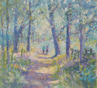
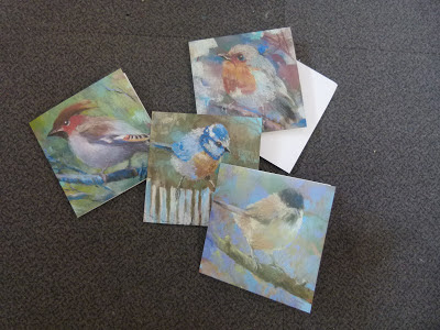
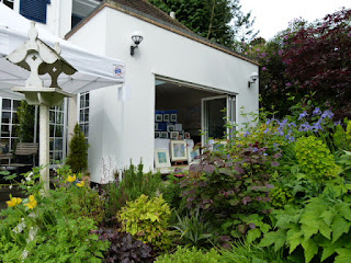
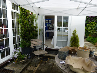
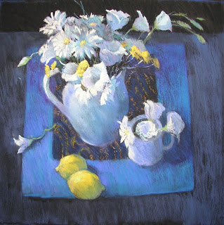
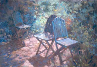
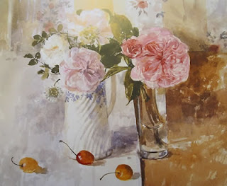
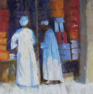
As for my Open Studio days............if you live anywhere within driving or commuting distance, I am 15 miles north west of London, you will be welcomed wholeheartedly, given drinks and snacks, can browse round a range of paintings from home and abroad, see my ceramics, glass, and enamelled copper items, and wander round my gorgeous garden.


for details and directions, email me to jackiesdesk at gmail.com


PAINTING - IS IT ABOUT THE MARKS?

$
0
0
I have been thinking about why it is that I have no problem making my landscape scenes look loose and impressionistic, but cannot seem to work in quite the same way with other subject matter.

Here is a typical garden scene of mine:

and here is a woodland scene:


I am sure you can see the similarities.  

Now look at this ....I feel it looks as if it was painted by a totally different artist:


I believe that this is because when tackling a landscape or garden scene, I give myself permission to be much more relaxed, and "loose" in terms of the marks I use. Particularly where foliage is concerned.   After all, foliage in general would look stiff and wooden if I painted every leaf carefully, or every blade of grass. So I automatically use a loose and sketchy method of approximating foliage.  BUT when faced with the shiny skin of cherries, the hard texture of glass, and the problem of getting the elipses of a glass correct.....I tighten up, work more slowly and carefully, and do not give myself permission to work in the same way at all.  My marks, in fact, become a secondary issue...I find myself trying not so much to make marks which suggest my subject, but instead, I try to make my subject look as good, as correct as possible, regardless of the marks I might use.  Here is another which looks like it was painted by a totally different artist, imho:


This sometimes is a frustration to me.  I WANT to combine good drawing with freer, livelier mark-making.  I set no store by a "photographic" result - if I wanted that kind of total perfection, I would simply take a photo!  I want my painting to look like a painting.

So, after a period of tossing these thoughts around - I tried really hard to combine the type of mark-making I might use to suggest foliage, with subject matter which contained no foliage at all.     The items on the market stalls are handled mostly with simple strokes of pastel ..looked at closely, there is little literal information for the viewer, beyond simple strokes and marks.  I just painted the shapes I could see when I squinted hard...I did not try to paint dresses or bags - the marks just suggest them.  I freely admit that the figure is more carefully and tightly painted - but give me time...perhaps I might eventually be able to realise a figure with the same freedom of mark-making as the background here.  That is the intention anyway!

I was quite lucky in that the umbrella threw a shadow onto the lady's bare skin and head...and as she was a dark-skinned Sri Lankan lady, that meant that those dark tones "melted" into the background better than if she had been very light-skinned.

The Yellow Umbrella, Galle Street Market, Sri Lanka.  Pastel on paper

Painting not just about capturing a wonderful scene...it is ALSO about making marks, on a surface, with pigment.  Artists don't grow grass, they suggest grass with coloured marks on a two dimensional surface.  Do you ever think about the actual marks you make, and whether the visible brushstrokes, or strokes of pastel, really help you to achieve your painting ambitions? Or do you just concentrate on making a tree look like a tree, a glass look like a glass?    


PREPLANNING FOR PAINTING

$
0
0
It is not always easy to find the discipline to pre-plan a painting....but it can pay off.
The Yellow Umbrella, Galle Market, Sri Lanka

You have various choices;  we have discussed this before, I know, but it never hurts to go over things more than once, and this suggestion is slightly different.

"Thumbnail sketches"..........when I was teaching and I said these words,I often saw glum faces around the room.  Some people did not seem to mind, but others just loathed the whole idea, they simply wanted, quite clearly, to GET ON with the painting, and doing a bit of initial drawing to get the subject onto the surface seemed quite enough to them.

Well -nobody can force you to do thumbnail sketches, I can only advise how useful they are,  they make you think more about the subsequent image, and work a few things out in your mind.

Going back to my students..........what I would usually find is that most people would simply plot their image, using outlines only - into their sketchbook, within a rectangle they had drawn.  But a line drawing gives you no idea at all about the overall tonal look of your painting-to-be.  Which area will be dark, which will be light, and how these areas will balance each other and relate to each other.  Where edges could be softened and tones linked to make a bigger, stronger shape;  where and how the eye will travel.

Scribbling away, even with a 4 or 6 B pencil, can take time, and often, can be unsatisfying, since bits of the white paper will still show through the scribbled tonal areas.  I would spot people just putting in a bit of random scribble, not even bothering to complete the shape,  and when I asked what they were doing, they said "oh, that bit just needs to be dark, this is just to remind me".


A thumbnail like this is really pretty useless

Now - here is another option. Why not work on TONED PAPER to begin with, using charcoal, and a bit of white chalk or conte.  Instantly, you can see where your light shapes will be, and your darkest tones, and those in between are "done" for you - it is really a great way to preplan. You can immediately see the balance of light and dark areas of the painting, and you will begin to get a sense of whether you need to make changes here and there.   Here is a tonal sketch I did for my Yellow Umbrella painting at the top of this post.  You can see how strong a tonal image it gives, yet it really only took a few minutes to achieve - there is little in the way of detail.  It was about half the size of the finished painting.


If you haven't tried this method, do give it a go, it is extremely satisfying to see, instantly, how your painting is going to look, rather than staring rather blankly at a whole lot of outlines which do nothing more than position the subject matter on the paper.  That is, I can promise you, only a tiny part of the challenge you face.

Sorry to be brief ...I am rushing to complete work for Open Studio, and can only manage a shortish blog post today.  Hopefully someone might find it helpful!

Make the camera your friend, not your master

$
0
0
I have been given permission to repeat a conversation I had with a fellow painter recently.

Here is the question posed to me:
The dog, I am concerned that maybe there isn't enough contrast or change of values to make it a good painting? Yet it's the narrow range of hues and the softness and subtlety that attracts me to it. I've already done the outline and it's ready to paint, so if this is the case, if you think it won't work as is, perhaps I could change some aspects of it from the ref pic? (eg, get a pic of a darker dog and use that as ref) I have cropped a bit off the left side to focus a bit more on the dog.

And here is the photo.  I am not a painter of animals by any means, but it illustrates some of the problems of working from photos, so I am using it here as a good example.


Firstly, squint at the photo and see how the dog's head almost disappears.  It can be an advantage rather than a problem to have one shape melting into another, but in this instance, the dog's head, and the tones and colours of the bank behind, are all of a blur when you squint. 

Then, just look at the tree on the bank.  It is all soft focus.  This is the camera focussing on the dog, and leaving the surroundings to be out of focus.  This is not how the human eye would see this scene.  Perhaps the distance, way behind the bank, could be left soft-focus, but something this close to the dog - nope, it doesn't work.

Here is a photoshop change or two.  I eliminated the tree and darkened the bank to reveal more of the head of the dog:


The image is immediately stronger.  Now what is to be done with the colour?  All "sepia" like the original photo is one option. 

 Playing around further in Photoshop with cloning, and colour, opens up your options, look:


Eliminating the bank all together, making the water and the dog the main elements without distraction, allowing some soft "sky" colour to touch the water,  plus hints of greenish stream colour, while echoing the dog's colours in the reflections and perhaps elsewhere too, gives a totally different feeling to the image.

Now this is all a question of CHOICE.  But at least the choice is now yours, not something imposed by the camera. Why copy slavishly if the photo can be altered to achieve a much more successful, or at least preferrable, result?

Please do not imagine I am a photoshop whizz-kid.  Nothing could be further from the truth.  I do not use layers...I simply use the clone tool, and add colour, and I crop stuff.  That is IT.  And I use Photoshop Elements, not the heavy-duty Photoshop.  I like things simple!

It is easy to be lazy and accept what the camera gives you.  But like my kiln when I work on my enamels, sometimes I get jewels - sometimes not.  Same thing applies to a photograph.  Look at it critically - see if you can spot the potential pitfalls, elements in the scene which make it obvious that the camera is your master.  Then, eliminate those problems.

And suddenly, the camera can become a useful friend to take around with you.

HOW TO AVOID MUD!

$
0
0
I have noticed many people asking why their pictures look "muddy".   I thought I would touch on it here.

A lot depends on the medium you are using.......creating muddy mixtures with wet paints is a fairly easy thing to do and a great deal will depend on the quantity and type of colours being mixed.    Creating a muddy effect in pastels, therefore, ought to be less of a problem, since they are a dry medium and no mixing on a palette is required...yet the subject STILL comes up.

So ..let's glance briefly at wet mixing.

When you mix, say, ultramarine blue (reddish blue) and alizarin crimson (blue-red)  nearly all of the yellow rays present in the light that strikes the pigments are absorbed and a bright purple or violet will be the result. BUT when you mix ultramarine blue (reddish blue) with a cadmium red  (orangey-red), which contains a good deal of yellow, the yellow in the cad red will change the mixture in a very different way, and it might become muddy-looking to your eye.  So, the moral of the story is to understand colour rules.  There are vast numbers of books available to you, so there is no excuse NOT to know colour rules!  Applying them is another thing.  Trial and error can work...but UNDERSTANDING works better.
A few things to think about:
  • If you mix complementary colours together, (do you know what these are???) you will usually end up with a  greyish or brownish mix....which can be lovely, but not if you do not want this! ( What looks muddy in one painting, may be quite different used in a different context.)
  • Do you understand "Triads" ?- again, worth looking up.   Having said that.....
  • Too many colours in a mix, and too many layers of paint, will almost certainly result in a muddy finish.
  • If you want a sparkling, transparent watercolour painting, then opaque and earth colours in watercolour can quickly "interfere" with a mixture because they have very little transparency.  So, if you used, say,  yellow ochre instead of raw sienna, you may feel that the mix you created is absolutely not what you had intended, despite the fact that yellow ochre and raw sienna seem to be quite similar! 
  The best way to learn about all of this stuff is to spend time practising, making notes alongside your colour patches.  Perhaps even putting identifying marks, or initials, on your tubes of paint.    Bit like doing five finger exercises on the piano...can be tedious, but is absolutely necessary if you ever want to play the piano well.  Colour exploration should treated as essential research and learning.   If you use watercolours, do you know, for instance, 

  • which of your pigments are transparent, non staining? 
  •  Which are stains?  
  • Which are opaque sedimentary pigments?  
If the answer is no and you would like a list, just let me know.

Another few handy thoughts.....................
Did you know that Winsor Blue is forty-five times stronger than French Ultramarine?  
Are you aware that it is a COOL colour blue, leaning towards yellow?  
Did you know that Winsor Yellow is opaque, while Aureolin is transparent?  
Did you know that Burnt Sienna is fairly transparent despite sounding as tho it ought to be an earth colour?

Do you rely on the old adage "There are three primary colours - red, yellow and blue" ? If you do, this could be part of the problem.   You need to know WHAT RED, WHAT YELLOW and WHAT BLUE you are using and why.   This little colour wheel is far more useful than a simpler one showing one red, one blue and one yellow.

 
  As I said above, if you wanted a bright, clear violet, then you would choose a red and a blue which carry violet within them.  Sounds logical, IS logical.      Then, it begins to make sense that if you wanted a dark, grey violet, you would choose an orange-red, and a greenish blue.  Both colours point away from violet, there isn't even a hint of the word violet in their description.  You need to get colour descriptions into your head quite firmly. (I recommend that you take the colour wheel above, lay it out as a chart and under the various headings, list your paints once you have identified which category they fit into.)

 I would refer you, at this point, to Michael Wilcox and his color mixing theories. His book, still available on Amazon,  is called "BLUE AND YELLOW DON'T MAKE GREEN". There is plenty to learn there and you might find it rather eye-opening.  I certainly did.

Another useful resource is Nita Leland's page, her split-primary system, which is essentially the same principle:  but she gives you actual paint names:
http://www.nitaleland.com/articles/split.htm
 
 It is really important to study theories like these.   This way, you will be able to train your eye, and your brain, and your hand,  properly.  The more you learn and practice, the more your sensitivity to colour will increase.

Before I go on to Pastels, look at this gorgeous image from Royal Academician Ken Howard.  Painted with plenty of so-called "mud", yet it so beautifully describes our UK grey weather and those touches of red and orange absolutely sing, making the neutral greys and khakis all the more effective and absolutely right - those "muddy" colours seem inspirational!:


So - what about dry materials like pastels?  

One simple answer to a muddy finish is to look at how you are working. 

 Are you working flat, allowing sleeves to brush across the picture and unwittingly mix the colours?  Working flat on a table with pastels is really not advisable.  The dust you create needs to fall away or it will contaminate the layers of colour.

Are you layering unthinkingly, just covering up one colour area with another, perhaps to disguise, perhaps to cover the paper...whatever, "unthinking" is the important word.  If you layer complements without fixing, for example, you could well be picking up underlayers which will physically mix with upper layers.  Visual mixing - tiny areas of red, for example, peeking through a larger area of green, can work to make an exciting colour mix...but mixing the red and green together physically can result in browns.  
Look at this simple example.  On the left, red marks were made first, fixed, and then green added over the top.   The green remains unsullied because the red has been fixed.   On the right, red was put down first, and green all over the top, without fixing.


The green patch on the right is far more "muddy" and brown.


BUT A good rule of thumb for the pastellist.......mud is not really mud.  It is usually a neutral hue of some kind.  Unrelieved areas of neutral greyish colour, in the middle to middle-dark range, could arguably be described as mud, but in fact, it is another word beginning with M which describes areas like this....Monotony. What is needed to avoid monotony, is areas of contrasting value, and intensity.  Then, "mud", or Monotonous colour passages, can in fact accentuate, or contrast with,  more  intense areas of colour in a painting.  It is all about balance, and design.  My painting below, Roses on a glass table, contains a large number of "greyed" colours, but there are also small touches of intense, sharper, more intensely colourful notes, which help to prevent monotony.


By and large, if your tones are right, you will often find that in a pastel painting, there is far less chance of "mud" than with any other medium.  But again...your painting will come along in leaps and bounds if you really know the colour wheel, colour temperature, how to distinguish darks from neutrals and how to balance your colours and use neutrals to good effect.

I wish you happy, mudless painting!


LEARNING TO BE PATIENT!

$
0
0
This week, I have to confess to standing on my soapbox. Possibly I may be accused, by some, of being a spoilsport, or pedantic, or lecturing.

But it is something I feel quite strongly about, so I will plough ahead and if my words resonate for someone, somewhere, I will be satisfied with that.

Lots of beginners yearn to paint portraits of their loved ones.  While I understand the impulse to leap into the deep end, and just do it, in particular if they have a photo they love and want to copy, nevertheless, I want to persuade beginners to realise that the best way to discourage yourselves is to set yourself up for disappointment.

I recently spotted someone asking for help with a portrait painting.  This person had no experience of drawing or painting in their chosen medium, yet they decided to jump straight in with copying a photo of their child.  The drawing was a reasonable attempt, but without any knowledge of the underlying anatomy of the human head and how to draw particular features, without any understanding of the possibilities available with techniques, without any appreciation of the need for good tone values ...the end result is likely to be a huge disappointment, since there is no way it will be an improvement on the photo.  The image above is a good case in point and I do not think I need to go into details about why this is not a particularly good drawing despite the artist's valiant attempts.
Jumping into the deep end like this, can be compared to attempting to play a complex piece on the piano, to an audience, when you have only just bought the piano and learned the basics of piano playing, and are still unpractised with reading music!

I know this sounds a bit hard, because everyone needs to start somewhere...but all I want to make you understand is that if you find yourself disappointed with your results, it is not necessarily to do with any lack of talent on your part, it is purely to do with lack of learning, and experience.
Portraits are arguably the most difficult of subjects to paint. I, with all my years of experience as a painter, avoid them because of their difficulty! They require enormous accuracy, and a thorough understanding of anatomy and structure to achieve success. Some  artists do seem to be able to capture a likeness effortlessly but they are the lucky ones. Others, like me, have to work slowly and carefully, measuring all the time, checking and double checking and yet still failing, and often failing to do it all effortlessly except on the odd occasion - usually when it isn't important. If you are trying to do a portrait of someone you love, you will want it to be good, to be right, to be recognisable.

So what is the answer if you REALLY are determined to get to grips with portraiture?

I seriously recommend that rather than simply picking up a photo and copying it,  you start by finding out all you can about portrait drawing and painting. there are good books out there, perhaps in your library. One I really recommend :

THE ARTISTS COMPLETE GUIDE TO DRAWING THE HEAD by William L Maughan.

He will show you how to understand value and tone, shadow shapes and edges, the form in light, the main principles of drawing the head including perspective, proportions, what to look for when tackling all the individual features of the head, structure and anatomy, highlights, and more, how to draw hair, putting it all together and the end section moves you from drawing to painting. Now perhaps, after reading this, you will see how much there is to learn about, and you will learn masses from him. It is an enjoyable journey.     Take a long, hard look at his drawings of eyes, ears, noses etc, and try copying them before you begin working from your own reference material - or model.  This is terrific practice - as an art student, I was recommended to copy master works regularly.


  Also, try looking at books on anatomy of the human head...understanding the underlying structure is very helpful indeed.


Find images which show how the features fit onto the underlying skull, seen from different angles and directions.  Look at these angle changes:


Then, if you have to work from photos, take good ones.  NOT with full face, and flashlight.  Flash flattens form.    Try lighting which is more natural, from a window to one side, for example.
Good portrait photo to work from, see how the lighting clearly shows the depth of the eye socket, and the form around the mouth, and the side plane as well as the front plane of the forehead.  Look at how the light beautifully describes the nose too.

classic difficult portrait to work from.  See how the lighting is flat and even, and there is little or no "form", showing the side planes of the face as well as the front plane.  Look at her nose...just a flat blob with a tiny bit of shading each side. SO difficult to work from something like this..almost doomed to failure before you begin.

  • Make sure you are comfortable and familiar with the techniques of your chosen medium.  This involves techniques practice. It is a good idea to practice quite separately from "doing a painting".  Practice with a purpose, perhaps making notes as you go along to remind you how you achieved certain effects. 
  • learn and absorb all you can about proportions, and how to measure accurately. 
  • Also ensure you have a good understanding of how to translate colour into the right tones. 
  • In fact, it is a good idea to begin with working just with charcoal or conte - in just one colour.  William Maugham will show you how in his book - as you can see from the illustration above.
  • When starting with colour, it is not good enough just to equip yourself with "flesh"-coloured paints and pastels. There are books on skin tones in portrait painting  and how to work with paints and pastels.  How to recognise what light does to skin tones, and what sorts of colours to use in shadow areas.  All useful info, it will help enormously.

I know this all sounds like a lot of work on your part, but I believe you will find it pays off in the end.  You cannot make a cake without breaking eggs, my mum used to say!

AND
I hope these words will encourage you to keep trying, but to keep trying with your eyes wide open and with a willingness in your heart to learn and grow and achieve success in due course.


Viewing all 152 articles
Browse latest View live