Quantcast
  • Login
    • Account
    • Sign Up
  • Home
    • About Us
    • Catalog
  • Search
  • Register RSS
  • Embed RSS
    • FAQ
    • Get Embed Code
    • Example: Default CSS
    • Example: Custom CSS
    • Example: Custom CSS per Embedding
  • Super RSS
    • Usage
    • View Latest
    • Create
  • Contact Us
    • Technical Support
    • Guest Posts/Articles
    • Report Violations
    • Google Warnings
    • Article Removal Requests
    • Channel Removal Requests
    • General Questions
    • DMCA Takedown Notice
  • RSSing>>
    • Collections:
    • RSSing
    • EDA
    • Intel
    • Mesothelioma
    • SAP
    • SEO
  • Latest
    • Articles
    • Channels
    • Super Channels
  • Popular
    • Articles
    • Pages
    • Channels
    • Super Channels
  • Top Rated
    • Articles
    • Pages
    • Channels
    • Super Channels
  • Trending
    • Articles
    • Pages
    • Channels
    • Super Channels
Switch Editions?
Cancel
Sharing:
Title:
URL:
Copy Share URL
English
RSSing>> Latest Popular Top Rated Trending
Channel: jackie simmonds artyfacts
NSFW?
Claim
0


X Mark channel Not-Safe-For-Work? cancel confirm NSFW Votes: (0 votes)
X Are you the publisher? Claim or contact us about this channel.
X 0
Showing article 21 to 40 of 152 in channel 6367999
Channel Details:
  • Title: jackie simmonds artyfacts
  • Channel Number: 6367999
  • Language: English
  • Registered On: December 12, 2012, 2:32 am
  • Number of Articles: 152
  • Latest Snapshot: April 24, 2025, 11:36 am
  • RSS URL: http://jackiesimmondsartyfacts.blogspot.com/feeds/posts/default?alt=rss
  • Publisher: https://jackiesimmondsartyfacts.blogspot.com/
  • Description: Artyfacts - - my own work and the works of others; glass, enamel on copper, pastels, oils,...
  • Catalog: //artyfacts1.rssing.com/catalog.php?indx=6367999
Remove ADS
Viewing all 152 articles
Browse latest View live
↧

WHAT TO DO WITH AN OVERWORKED PAINTING

November 5, 2012, 2:11 am
≫ Next: VIRTUALLY VISIT AN ART MUSEUM
≪ Previous: Colourful Whites
$
0
0
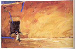
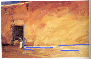
Overworking a painting is not at all uncommon, so don't beat yourself up if you find yourself doing this;  it is easy to keep working on a painting while you are trying to get tones and colours right.  Sometimes though you get to a point where realisation sets in...you have overworked the image and alternative action needs to be taken, because the picture is looking kinda tired - as are you.  Correcting, however, needs to be done carefully.   Knowing what is possible is important, or you may just make matters worse.

If you try to correct a WATERCOLOUR painted on "woodpulp" watercolour paper - generally the more economical brands -  this can be pretty disastrous.  Trying to wash or lift out a painted area, even gently,  will often pull up the top surface of the paper; you can suddenly find that the paper breaks down and you begin to get little paper crumbs on the surface! Often adding more colour on top just creates more crumbs. 
 You will have more success, however, with a good quality RAG paper, since this is made from 100% cotton rather than processed wood fibre. You can attack this with great gusto, a toothbrush and plenty of water, and often take off lots of the paint without ruining the surface at all. I often worked on Arches paper, and if a painting became overworked, I would hold it over the bath, run the shower on it and scrub off the offending area!   So the moral of the story is....either get your shapes and tones right on inexpensive papers....or work on better quality paper which will give you so much more flexibility.

An overworked OIL PAINTING can be saved during the process of painting by the simple process of scraping the paint off! Do this gently with the side of a palette knife.    Otherwise, you can do a certain amount of overpainting if you place some newsprint paper down onto a thick sticky area, allow it to soak up some of the oil, then rub it gently without shifting the paint, it will lift some of the paint, then the painting can be left to dry somewhat before reworking.  This is a technique called TONKING, some painters do it with thin muslin, or kitchen paper, or strong tissues like mansize Kleenex.

An overworked ACRYLIC is far less of an issue - the surface can be overpainted time and again without causing a problem for the underlying layers.

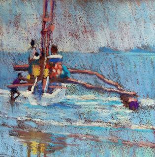
An overworked PASTEL is much trickier.   Dealing with an overworked pastel depends on certain circumstances.  

1.  If you are working on pastel paper, and have not used any fixative, then instead of working on incessantly, trying to adjust shapes or alter colours, you have the option of BRUSHING OFF, using a stiff brush, this will remove a lot of the pastel on the surface, leaving a hint of colour on the paper, which can then easily be reworked.   If you work on and on, over and over, you will lose the tooth (texture) of the paper, so brushing off is often your best option.

2.  If you have worked with hard pastels, you can "correct" by SPRAYING WITH FIXATIVE, and then by working with a layer of SOFTER PASTELS over the top.

But....what if you have tried all of this, have brushed off,  worked with both hard and soft pastels, have used fixative between layers, and it still is not right and needs further work but the tooth of the paper is totally gone...what then?

I came across this tip only recently, you might find it worth a try.

You need some plain BAKING SODA, or BICARBONATE OF SODA (depending on whether you live in  the US or UK.

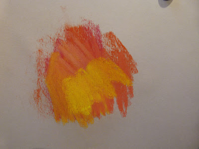
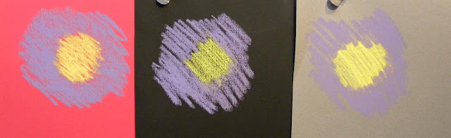
STEP 1: Here is my test sheet. On Fabriano Tiziano pastel paper,  I put down several shades of reds and oranges, building up a good few layers until the tooth was virtually lost.  You can see this from the peach colour at the top, there is no sign of red through it, meaning that there was no texture left. I sprayed with  quite a lot of fixative, and then put the yellow on top.

STEP 2.  I put a couple of spoons of baking soda on top of the area. 


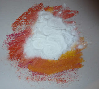
 STEP 3.  I rubbed it in, quite strongly, with my fingers.  You can see that the crystals of powder pick up the colour of the pastel.


STEPS 4/5.  I tipped the baking soda off, then repeated Steps 2&3.

Here is the area, with the final application of baking soda tipped off.  It has worked very well indeed, the fixative has been absorbed by the crystals, as has much of the pastel colour, and there is just a haze of colour left on the paper, which you can see through the remaining colour.

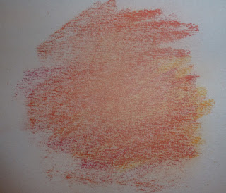
The texture of the paper can be seen too, it has not been damaged in any way, so the surface will now take more layers of pastel without any problems at all.

This is a terrific tip, sorry if you all ready knew about it, hopefully there will be some readers who did not, and will find it helpful.

Jackie


↧
Search

VIRTUALLY VISIT AN ART MUSEUM

November 12, 2012, 3:36 am
≫ Next: BEING AN EXHIBITOR AT AN ARTISAN/CRAFT FAIR
≪ Previous: WHAT TO DO WITH AN OVERWORKED PAINTING
$
0
0
I have always wanted to visit the MoMa.  Now I can, any time I want, from the comfort of my computer chair!


I came across the GoogleArtProject (this is a link)  just the other day.  I know it has been around for a while - since February 2011 in fact - so why I have only just heard of it is beyond me, but given that I didn't know about it, I am hoping that it might be new to some of you too.

The Google Art Project puts a huge number of works of art, from a variety of art museums, literally at your fingertips.  This is not at all the same as looking at postcard- or postage-stamp sized reproductions on your screen, this is almost like being up close and personal with the actual paintings or artifacts, possibly even closer than you might be able to get with a frowning museum guard demanding that you step back please!  ( I know why they have to say this, but it is such a frustration!)

The brilliant people at Google decided to use their technology to make art in museums more accessible - particularly to those not lucky enough to have great galleries right on their doorstep.  They set up a unique collaboration with individual museums around the world, using extraordinary tools like Google Street View to step right inside some of the galleries to have a look around.

You will be able to visit MoMa in New York, the State Hermitage Museum in St Petersburg, Tate Britain and the National Gallery in London, the Uffizi Gallery in Florence, the Van Gogh Museum in Amsterdam,  The Art Gallery of S.  Australia, amongst many others.  What a treat.  There are 151 museums to "visit", in 40 different countries!

As of 30th October 2012, Google say that 29 new art organisations from 14 countries have agreed to bring their collections on line, bumping the total number of treasures you can view via Google to more than 35,000.  The most notable new addition this year is 139 works of art from the White House.  

Here are some of the things you can do:


1.  ZOOM IN, TO SEE BRUSHSTROKE DETAILS. 

The level of detail it is possible to see by zooming in, is quite extraordinary.  You can almost feel the brushstrokes as you look at them.  In some instances, the artworks were photographed using "gigapixel" photo-capturing technology, which provides around 1000 times more detail than your average digital camera.  This is not true of every painting, just certain paintings, but when you do find the images photographed in this way, the level of detail is mind-boggling.  The zoom feature allows viewers to get inside cracks in the parchment and other details not normally visible to the naked eye.


For instance, in Peter Paul Rubens' masterpiece "The Death of Adonis," the technology allows the viewer to focus on a tear on the cheek of Venus that isn't obvious when facing the actual piece.

Degas Swaying Dancer normal view


zooming in......remember, this will be the full screen on your computer


2.  USE STREET VIEW TO STEP INSIDE A GALLERY

Google's Street View team designed a brand-new vehicle called the "Trolley" to take 360 degree images of the interiors of certain galleries, which were then stitched together enabling smooth navigation of rooms within the museums.  There is also a clickable feature so you can jump from being inside a museum one moment, to viewing a particular artwork the next.  There are info panels which give you information about an artwork, direct you to more works by that artist, and send you to see related YouTube vids.


Interior of MoMa


3.  CREATE YOUR OWN COLLECTION

With this feature, you can save specific views of any of the artworks, and build your own personalised collection. You can add comments to each image, and you can share the entire collection with your friends and family.  More than 300,000 users have created their own online galleries to date.

4.  COMPARE ARTWORKS

There is a compare button on the toolbar to the left of each painting, which allows you to examine two pieces of art side by side.  You can - apparently -  see how an artist's style has evolved over time, you can connect trends across cultures, or delve deeply into two parts of the same work. This could be an amazing educational tool....if you can get it to work.  I couldn't !!  If anyone else can, perhaps you can tell me what I might have been doing wrong!  I got the "drag it here" pictures, but nothing would drag.  No "help" guide either....a gap I think...Google team, please note. As far as I could see, we are expected to find our own way intuitively around the site.  This may be OK for some, but I still feel a "help" guide would be welcomed by many.


You might enjoy these YouTube overviews:(click on the links)

How to use the site:  this was a bit fast for me.  You might find it useful tho.

Behind the scenes - 4 fascinating speeded-up minutes which show the Google team at work all over the world.  Again, a bit fast for my poor eyes, but I enjoyed it nevertheless.

and another here  Interviews as well as shots of the team at work. This one is a bit slower and easier to cope with!

For educational art projects, this site must be invaluable.  For entertainment from your armchair, it is pretty unbeatable if you love art.  Although I do feel that nothing quite replaces the actual experience of standing in front of a painting and drinking it in, I am realistic enough to know that I may never get the chance to visit some of these wonderful museums and see the artworks for myself, so this is a darn good second best!


↧
↧

BEING AN EXHIBITOR AT AN ARTISAN/CRAFT FAIR

November 19, 2012, 2:43 am
≫ Next: USING A COLOURED PASTEL PAPER
≪ Previous: VIRTUALLY VISIT AN ART MUSEUM
$
0
0
This past weekend, I did my first Artisan Craft Fair.

If you have always liked craft fairs, and feel you might like to try one at some time, I would encourage you to have a go, and perhaps this information may be of help to you.


DO YOUR HOMEWORK

To begin with, do check out the fair you intend to try for.  I looked at local fairs only, because I knew it would be tiring and did not want a long journey on top of everything else I had to do.  I went to visit three local fairs, to see what kinds of goods were being sold.

YOUR PRODUCTS AND PRICING

You need to be sure that your products will "work" with everyone else's - ideally, it would be good to have as little competition as possible, but more than that, make sure that the price range is appropriate too. I could be wrong, but I feel there is little point in trying to sell expensive paintings when everyone else is selling soap and greetings cards.

The first fair I visited, in a church hall, was all soap, greetings cards, and rather cheap jewellery. I sensed I would be out of place there.

The one I liked was held in a massive ancient renovated barn with stalls both inside and out, food items outdoors and a kiddies' area.


  There was music playing, and an enormous variety of products for sale, including a few stalls selling beautifully made ceramics, lovely woodcrafts and  real silver jewellery.  I felt that my enamelled copper pieces would fit in well, and the organiser agreed.  So, I became a craftsy person for a weekend.


BEFORE THE EVENT

Find out the size of the table you will be given (and the cost of course).  Try, at home, to work out how to display your goods.  Height is the way to go, if you only have one table.  Some kind of shelf unit will be helpful.  I made one - a shelf with four legs, so that I could display goods on the shelf, and on the table below.  I also was lucky enough to have a perspex cabinet which you can see on the right here.


Here is a photo of a stand at a very smart Ceramics Craft event, you can see how height is important:


Prepare, in advance, some cards or flyers about yourself.  Also, something I failed to do was put out a book where people could enter an email address for, say,  future information - as this potter has done.  Bad me. However, I did not have the kind of space he had...!


Organise a book to write down all sales  and wear a cross-body bag or body belt bag for takings.  Take with plenty of change - notes and coins.

Provide a table cover.  A sheet over a table will allow you to store your boxes underneath.

Buy wrapping material. Not old newspapers or old carrier bags.  Go online to find inexpensive tissue, and pretty carrier bags.  Buyers really appreciate this.

Consider a way to accept Credit Cards.  Some fairs have a central payment facility, others have nothing.  In the USA, there are various credit card payment methods that individuals can use, some which attach to a mobile phone.  This SEEMS to have finally reached the shores of the UK, although I have no direct experience so without giving any comment about this one way or the other, do feel free to investigate:
https://sumup.co.uk/product/

Wrap up warmly if you take on a winter fair.  Barns and marquees are unlikely to be heated.  So not just a warm coat and thick scarf, but the most useful thing of all....thick-soled boots! This will stop the chill creeping up from the soles of thin shoes;  the cold creeps up legs and inside warm coats.

ON THE DAY

Unless you are a really early bird, you may find that you cannot park very close to venue.  So it is really important that you think about how you will get your products to your stand.  I used a little "flatbed" trolley, as did many other stallholders.  It was invaluable.  I was able to load all my boxes in one go, and wheel them into the venue.


WATCH AND LEARN

I learned quite a lot.  One thing became apparent quite quickly.  A craft fair is not quite the same as a proper ART and craft fair. The expectation, from the visitors, is bargain prices, and fun items.  I did sell quite a few of my bowls, I am pleased to say - but in general, I quickly became aware that visitors were mostly looking for cheap and cheerful Christmas gifts.  The same thing cannot be said of a major ART fair, I visit a huge one every summer called "Art in Action",  artists not only sell their wares, they demonstrate too.  The expectation from the visitors is quite different.  Visitors expect to find quality art items, and are prepared to pay high prices for unique pieces.  Having said this....major art fairs of this kind are expensive for the exhibitor to attend;  smaller craft fairs are priced quite differently, at minimal cost for a table.

MANAGE YOUR OWN EXPECTATIONS

So - provided you manage your expectations, you can have a lot of fun. Remember the saying...."he who expects little is seldom disappointed".  The girl behind me sold almost nothing, despite the vast attendance.  It can happen, she said -  she was fairly philosophical about it whereas I would have been devastated.  But she knew that no two weeks are the same.

Prepare well, keep your expectations in check, and have a great time.  I did.


Last but far from least..........TAKE A SKETCHBOOK!  The sketching opportunities are endless, and between sales, you can sit and quietly  capture some special scenes.  (This young man in the middle has a baby animal - perhaps a rabbit or guinea pig - stuffed down his jacket and is eating its carrots.......)


↧

USING A COLOURED PASTEL PAPER

December 5, 2012, 10:13 am
≫ Next: PAINTING SNOW & ICE AND MORE...
≪ Previous: BEING AN EXHIBITOR AT AN ARTISAN/CRAFT FAIR
$
0
0


I have just finished an article for The Artist magazine (UK) called Impressionist Techniques for Pastels, and my research got me thinking.
The Impressionists preferred a light ground to work on, unlike the Masters of the past, who would often work on a dark surface for their images, which depended a great deal on “chiaroscuro” – light AND dark –often more dark than light.  The Impressionists, who usually worked in front of nature,  felt that the white of a canvas, or a very pale ground, would “illuminate” their work – they wanted to capture effects of light and they tried to see colour in the shadow areas.  This got me thinking about coloured supports and how they affect our work.
Most pastel beginners start with simple pastel papers rather than prepared boards or painted surfaces.  The papers come in all sorts of colours, from very light to black.  When I was teaching, I advised my beginners to use a simple grey tone, or oyster colour, since this would not cause them any problems, it was neutral in both temperature and tone and would blend nicely with whatever colours they chose.
Some of the coloured papers are in fact brilliant tones – reds, bright greens, rich blues….but a word of caution if you decide to try some of these.  The papers may be lovely colours – but the inks used to dye the papers are often fugitive and will fade after a time when exposed to light.  It is vital to cover the paper as much as possible if you want to avoid this.

So if you plan to cover the paper………..why does the colour of the paper matter?
Well, pastels are opaque, yes,  but the papers also have a certain amount of “tooth” (texture) and the pastel marks will skip across the very top surface and leave tiny areas of paper untouched.  If you do not fill those areas, the paper colour WILL influence the final image. 

Here are a few examples, each created with the same sticks of yellow and purple.  You can see how the paper colour does matter. The central yellow patch looks almost green on the black ground;  the purple surround, and the yellow patch, are extremely warmed up by the red ground.  Only the grey ground has given fairly "true" colours.


Using a strong paper colour makes a great deal of difference in the early stages and will alter the atmosphere of the picture quite dramatically.  You need to take this into account.  If you want a light, airy atmosphere, and plan to use fairly light tones throughout, then using a light tone of paper will aid you rather than hinder.  If you want a dark, moody image, then using a dark paper will help to create the desired effect.   If you want a distinct temperature – for example, a snow scene – you can find that using a warm colour of paper will give just that little hint of contrast, somehow making the cold colours seem even colder, while a cold colour will blend well without that contrast.  Why not use green for a landscape image with lots of foreground grass?  Well, you could….but again, you will lose those lovely hints of alternative colour peeking through from underneath, which add variety and interest to your passages of green.  Artists use this layering of alternative colours to great effect.

In this marvellous portrait of Van Gogh, the painter Toulouse Lautrec used a web of pastel marks which not only allowed previous layers to show through, but also the colour of the cardboard on which he worked can be seen in hints - cardboard is a neutral tone, which would not have "argued" with the layers of pastel added to it.

"Portrat des Vincent Van Gogh" by Henri Toulouse Lautrec   54x45cm

The image at the top of this blog is another by Toulouse Lautrec, "Woman in a corset".  He has left a lot of the original  "under" colour to be visible, and see how beautifully it works in contrast with the cool colours used in the upper half of the image.  This was clearly not a random choice.  I absolutely love the unfinished nature of this drawing, I hope you enjoy it too.


Rather than pick out a random sheet of colour for your pastel paintings or sketches, without thinking too much about it, it is worth spending a little time thinking carefully about the colour wheel and how the paper colour might influence you work, also spend time considering the overall effect you want to achieve, then choose a colour which will help you achieve your end aim.


↧

PAINTING SNOW & ICE AND MORE...

December 10, 2012, 4:10 am
≫ Next: Stretching one's wings
≪ Previous: USING A COLOURED PASTEL PAPER
$
0
0
For some of us, the latter months of the year mean SNOW &  ICE scenes, which are super to paint provided you are not standing in it for too long.

So, short blog this week...just a word or two of advice.  If you decide to go outdoors to paint snow, then the most important bit of kit you can have is WATERPROOF BOOTS WITH THICK SOLES.  The cold creeps up your legs from the ground, and no matter how many layers you may be wearing, if your feet get frozen solid, your legs will quickly follow and you will feel horrible.  Do not attempt to go out into the snow, to stand for lengths of time, wearing simple rubber waterproof boots.  It wont be more than a few minutes before you will be numb and frozen.

Next bit of advice........although snow and ice may be white, try to find alternative colours to use. Blues, purples, pinks, apricots - they can all be found in snow scenes.  Particularly when the sun shines.  The sunshine will PAINT the snow with shades of gold and pink and orange.........and the shadows will be blues and lavendars and purples.  Can't see this?  Take a white sheet of paper or card out with you, and hold it up so that you can see the snow or ice, and see the white paper, and see how the colours change according to the prevailing light.  You may have seen this before, but just to make the point that you need use very little actual WHITE:


Finally, I am going to close today with a couple of little offerings, you may want to treat yourself to for Christmas.  the first is one of my enamel on copper bowls.  I feel it looks rather festive!  It is 4" in diameter, and 2" high, with sprinkling of Christmas-y colour inside nestling in the brilliant red enamel at the base, with bright orange around the top rim.  The outside is kind snow or ice-like, a beautiful limpid pale icy blue which seems to hover on the surface, with subtle mottling just like ice on a pond.  Enamel is marvellous;  you can wash it, put candles in it without fear of burning the enamel, it will never lose its shine and colour.  This bowl would look fab with gold-coloured wrapped chocs in it, on your Christmas table:


The price of the bowl is £25 plus postage at cost.  ($39)   If you would like it, I need to know where you live, to work out the postage.  It is a unique piece, you will never see another like it, as no two bowls I make are the same.

Also, I am offering this image of ATHABASCA FALLS in Canada, anyone who has been to Banff will recognise them.  The painting is 15x10.5", pastel on Canson Mi Teinte Touch card, which is firm enough to send out unframed, you will be able to frame it with something of your own choice.  Unframed means I can offer it at a really good price - only $130.  I am showing it quite large so you can see it best:


Finally, here is one I have decided to call "Snow Veils" .  It is mixed media, with "veils" of Japanese papers with gold threads, and acrylic on card.  It is framed right now, so I am showing it framed, and can send it framed for $100 but it can be sent out in just its mount ready for you to frame.  The image is 6"x6" (framed it is  11x11")  -unframed  $75 plus postage.


If I do not manage another blog post before Christmas day is upon us - it is coming up fast, isn't it! - I hope you all have the most marvellous, happy, fun time.  Despite all good intentions, Christmas can be stressful - keep taking deep breaths and don't let anyone or anything get you down!  Just keep smiling!

jackiesdesk@gmail.com


↧
↧

Stretching one's wings

December 19, 2012, 5:33 am
≫ Next: OVERCOMING THE BLANK CANVAS MOMENTS
≪ Previous: PAINTING SNOW & ICE AND MORE...
$
0
0
I have mentioned previously that I do wear more than one hat.  Not only do I paint, I also am a "crafter"  in between paintings and this month have had quite a lot of fun doing Art/Craft markets with my enamels.  There are links in all creative pursuits - stretching one's wings can be very rewarding.

In case you are a "new reader", here are some of my items - as you can see, I cannot totally break away from my figurative painter roots!


This plate is about 6" in diameter.  Originally, there were no wildflowers......I kept looking at it...I was not very happy...it was a bit bland.  So poppies were finally added.  It is interesting to me that my knowledge as a painter feeds into any other pursuit I try - in this instance, understanding about change of scale, tone values,colour temperature and composition - all helpful.  A willingness to diversify and try something  new and potentially risky when I was not happy with the design at one point - more than helpful, and it worked.


For this bowl, I tried "printmaking" - I found an appropriate stamp, printed onto the outside of the bowl, covering the ink with enamel, then firing the bowl.  I did this a few times, adjusting the placement of the pattern.


Here is another plate, about 5" wide, this time a snow scene.  I used some warm colours to give the piece some interest - all white would have been too cold and a bit monotonous...something else I have learned thro painting.


This strongly coloured plate is one of a "forest" series. Notice the linear elements - those tiny lines you can see drawn thro the green and turquoise areas - they add interest and variety and change of scale among the larger semi- abstract leaf shapes, and mysterious dark patches.  Selection of tone and colour came from my years as a painter.  It paid off...this one is sold!


Sometimes, the results are somewhat unpredictable.  This bowl which is greens and blues on the inside, was covered in a soft white enamel on the outside.............left in the kiln a little longer than normal, I ended up with an outside which shades from blue thro to black then to maroon on gold.......extraordinary .....
here is the outside........


This bowl is a favourite of mine BECAUSE of the unexpected results.  One thing I have learned as a painter is to celebrate the unexpected. To take chances sometimes, try out ideas and take risks even if I risk ruining a painting.  Being experimental and rash on occasion, breaking rules, surprises can occur which are delightful.  Oo - deja vu - I suspect I may have said this before, if so, it means I really mean it!  It takes me back to my years as a student.  I worked for ages on a watercolour painting.  It was safe, predictable - and deadly dull.  I got so cross with it, eventually I tipped my palette onto it, dripping wet paint onto the nice, safe flat washes..............and my tutor's brother, a very creative chap, walked into the room and said "Wow - that is really exciting!".   It actually was!

However, one thing to bear in mind.  Although the unexpected may well occur in the process of producing my enamel pieces, that does not mean lack of pre-planning.  I consider colour, and shape, and form, with every piece.  Doesn't always go to plan, but that is OK.  Same thing applies to a painting.  I always do a thumbnail sketch, and think about the colour scheme in advance, I even sort out the main colours I plan to use, and put them aside.  If working with a wet medium like oils, I would make up little piles of appropriate colours in advance.  If at some point during the painting process, I feel I have lost my way, or the painting is boring and needs something else - rather than put it aside for good, I will freewheel for a bit, trying out new ideas - sometimes it pays off!

There are lots more bowls and other items to be seen on both my Facebook page, where there is album of photos, and on my website - www.jackiesimmonds.com

I wish you all a very happy Christmas next week, full of happiness and cheer.

Jackie


↧

OVERCOMING THE BLANK CANVAS MOMENTS

December 29, 2012, 4:25 am
≫ Next: PAINTING HOLIDAYS - part 1
≪ Previous: Stretching one's wings
$
0
0


I recently read an interesting article about “ideas to creativity” and how to overcome the blank canvas moment – that horrible, terrified paralysis - that hits many of us from time to time.  Hopefully, the author will not mind if I repeat  some of his words of wisdom, along with a few positive thoughts of my own.


      1. "Being an artist takes courage. Art and creativity is an expression of the self and with that comes fear of rejection and fear of failure"       Often, when embarking on a “project”, it can be quite scary because of the fear of failure.  Try NOT to have a rigid aim.  Of course, if you accept a commission, this IS pressure, and pressure often does not allow for failure – but the fact is, you need to allow for it, and be prepared to start again if need be. Allow it as part of the process.  Fact is, the fear of failure will show in the work, in the form of too-careful or too-timid passages.  If you have to start again, take a deep breath, and begin again with a glad heart, it will show in the work.

   2.    If something isn’t working too well – ask yourself “what if?”.   What if I try a totally different colour just here?  What if I cut off the bottom half, or top half?  What if I spray the entire surface with water?  There are loads of “what if’s” you could try.  Some might be a bit of a disaster, but others just might rescue a piece.  What if you take a risk…and it pays off?  Just imagine how good you will feel.

     3.  Always worked within a rectangle?  Try a tall thin support, or a wide narrow one, or a square.   See what happens.  It can be very liberating!  This is part of No. 2 really but I offer it as a separate thought.  It can make a HUGE difference to how we approach our work, particularly if we work on the flat two-dimensions of paper or canvas.  If you always do what you've always done, you will always get what you've always had........

    4.   If really stuck and thoroughly fed up,  put your work to one side, and then find loads of different bits of reference materials.  Sketchbooks, magazines, objects,  all sorts.  Pin stuff up around your workspace. Look at the website “www.pinterest.com” for inspiration and print off favourite images – you can put in search terms relevant to whatever it is you are currently working on, this will bring up images in other people’s collections..  This can lead you to a new thought process in your current work…and can lead further to a whole body of new work, based on the new inspiration. 
    Here is a Pinterest "art" inspiration page:


      5. .Again – a spin off from No. 4 – artists need to be magpies.  They need to notice things, search for things, collect things.  The more you do this, the more your imagination will be stimulated.  It is the same as "feeding" your artistic soul.  Looking at the world, noticing anew, with a sense of curiosity,  awe and wonder, will usually refresh and reignite your creative spark.

     6.  Hold your work up to a mirror, and ask yourself very specifically what you like and what you do not like.  Change what you do not like!  Even if this means spoiling what you do like.  Sometimes, it HAS to be done.   Listen to the voice of integrity inside of yourself saing "come on, you know you have to change it..." and Be Brave.

     7. Try out those new materials sitting in your drawer!  I know artists who buy expensive paper, and then sit there looking at it, terrified to use it for fear of spoiling it.  Well, if you do not overcome this fear, you will never experience the potential joy of discovering a wonderful new experience, the start of an exciting,  fabulous relationship with a new product.

     8.  Give yourself proper credit.  If you are negative, saying to yourself “oh, this is just awful”......  this is you judging yourself too harshly.  Instead, say “well, I have done my best, and actually, I got this bit OK and that bit OK".  Recognise that over time, you will, WILL, improve, it is inevitable.  Artistic "talent"/technique is a muscle that has to be exercised regularly. Nobody is perfect from day 1  !

    9.    If you can get some help – for example, showing your work on www.wetcanvas.com, will bring you suggestions from other, really helpful artists – then go for it. Never be too proud to ask for the advice and help of other artists.   It will help you to improve more quickly when other eyes point out things you may have missed.  BRemember -  you need to be patient.  It takes time to improve.  But improve YOU WILL.

1   10.    Remember the three P’s.   I have mentioned these above and in previous posts but here they are again.  They are important to hold onto and work with.  Patience, Perseverance and Practice. 

                              ........................................................

    Now having finished this little "lecture".............I just want to say thanks to all who have supported me, not by just reading this blog regularly throughout 2012, but also by buying the occasional offering from me, for which I am very grateful.  I will have a busy 2013 - more paintings, more Open Studios, more art bowls and plates, also some jewellery, where I am combining all the new skills I learned this year - here are some of the pieces under construction (changes have been made but not photographed yet).  Large pendants, with enamel on copper, silver and semi-precious stones - let me know if any appeal to you in general, I can give you more photos and prices.  I am waiting for more of the black chokers right now and am experimenting with different beads and shapes - square ones are under construction too, they are rather cool.  I have loved making these, combining "painting" with enamels, and shiny bits - magpie me!


↧

PAINTING HOLIDAYS - part 1

January 7, 2013, 1:16 pm
≫ Next: PAINTING HOLIDAYS – PART 2
≪ Previous: OVERCOMING THE BLANK CANVAS MOMENTS
$
0
0
Egypt - Luxor market side street.  Notice the  missing leg on the chair, which is propped up by  a box!  It is such fun when you suddenly notice little things like this.   Watercolour sketch completed on the spot.  


The excitement of new sights and recording your experiences on paper or canvas adds a new dimension to any journey.  Travellers of old knew this;  organised expeditions to distant shores often had an artist on hand to record new and interesting sights en route or at the destination – certainly in the years before the invention of the camera, this artist must have been an invaluable asset.
Statues of Memnon at Thebes - during the Inundation.
David Roberts (1796-1864)was one such painter, here is one of his amazing records. (I have visited this place - I was given 10 minutes to sketch!  SO annoying. But at least there was no "inundation" at the time!)


Photography might have taken over to an enormous extent…but nothing can replace the pleasure of actually painting what we see.  It is such an enriching occupation – we artists are so very lucky.


A painting holiday often differs slightly from a painting workshop, in that you are often given the freedom to choose your own painting site and your own painting approach.  The tutor in charge may well offer advice along the way, but you do need to be somewhat independent, and have the ability to spend time working on your own, until you meet later in the day with other students and tutor to see what everyone has been doing.

The social aspect of a painting holiday should never be underestimated.  It is a delight to be with others with shared interests.   However – a few words of caution:

Choose your painting holiday carefully.  Do some research and find out how the tutor intends to structure the holiday and see if it appeals to you.  You may find lots of help on offer from some tutors,  but very much less from others who simply allow you to watch over their shoulders as they work. It is really important to manage your expectations.

 Choose the location carefully…it can be wonderful to be seeing the world-famous sights you have longed previously to see, but artists do often return despondent from great cities, having been overwhelmed by tourist sights and crowds.

You would do well to avoid a tour, or multi-centre arrangement, particularly if it means travelling around by coach and stopping for short periods while travellers hop out, take a few photos, and jump back on the coach.  Brief encounters are NOT healthy for the artist.  A camera cannot do the same job as your eyes and your memory and cannot begin to replicate the experience of drinking in the scene as you attempt to sketch or paint it.  I visited Israel with a group of artists some years ago.  The tour operator wanted to show us everything, so we were raced from spot to spot.  We rebelled and insisted upon at least an hour at a stop, in order to do some sketching.  The tour operator was horrified – it meant we would see less….but that was HIS priority, not ours!

Off-the-beaten-track places often make for good painting locations.  Quiet villages, back streets, something as simple as a doorway  or window can be just as evocative and fascinating as a full-scale scene or distant view.

Ithaka Gate - watercolour sketch done on a Greek island painting holiday.  Dodgy perspective - but I don't care, it is in my sketchbook and takes me right back to the place where I sat and painted.  I can even remember the smell of the scented tree behind me.
Take the weather into account.  I have just booked to paint in Sri Lanka in March.  I am now worried because I have just read that the temperatures could be in the mid 30’s.  I will struggle with this and had I done my research properly, would have perhaps chosen an alternative location.  For the painter, airconditioning is super – when you get back to your room…but painting in a VERY hot street, or even just sitting to do a quick sketch –can be very uncomfortable indeed, as you sit there slowly melting!

If you travel to foreign shores, in particular the hotter countries on my side of the world,  like Egypt, India, Morocco, even Spain, Greece and Italy, do please bear in mind that
your tummy may suffer from the change of water and sometimes even the change of food.  The inconvenience of this cannot be underestimated, I have seen it happen time and time again.  The best advice I have ever been given, which worked for me and my adviser, while others crashed around us:

  • DO NOT DRINK THE WATER.  stick with bottled mineral water, Sprite or coca-cola; 
  • avoid salads at all costs;
  • eat only fruit that you can peel
  • eat the local hot food, which will have been purchased at the market in the morning and cooked freshly. 
  • Try to avoid anything which might have been pre-frozen.
  • Avoid ice, and ice-cream too. 
 I know this sounds like scare-mongering, but as a well-travelled painter, I can tell you that this advice comes from direct experience and from watching the suffering of others!!!  It is just that those of us who live in England or the USA are used to water purification treatments which are different - not better, just different, and our tummies are not geared to deal with the change.   It is usually the water that is the culprit – the suggestion to avoid salad is based on the fact that the salad will be washed in the local water!

If you plan well, you should have a wonderful experience.  There is more to add but I will keep my remaining suggestions for part two, and just leave you with an image I painted after sketching in Venice, at night, by the light of a small candle on the table!  Around me were the most amazing characters in full fancy dress - it was Carnevale time.  Now THAT was a painting holiday memory I will always treasure.  

Florian's Cafe, St Marks Square, Venice.  Pastel on paper


↧
Search

PAINTING HOLIDAYS – PART 2

January 16, 2013, 1:17 am
≫ Next: The work of a Formal Expansionist
≪ Previous: PAINTING HOLIDAYS - part 1
$
0
0

Pastel painting, done on the spot in Cyprus

Some more thoughts about the whole business of going on a painting holiday.

BEFORE YOU LEAVE:

Do go well prepared.  Find out what materials the tutor suggests, but do not treat any list as law.  I have been with students who have said to me “I didn’t bring x or y , because it wasn’t on your list”.  This is daft.  If you have favourite bit of kit, TAKE IT WITH YOU.  The tutor’s recommendations are just that – recommendations, based on his or her experience. 

Think about how you will get your equipment to the painting locations, if the holiday is one where you will be taken out and about.  If you have a bad back, it might be wise to have something with wheels to carry your kit for you, rather than aggravate your back. 

  If you like to sit to work, take your own painting stool, there are very lightweight ones in the art materials shops or in fishing tackle shops.  A lightweight metal easel weighs less than a wooden one, but if the weather is windy, you may need to think about how to manage that.  There is a lot to think about, I know, but the better prepared you are, the more you will overcome any kit issues.


Here is my check-list of sketching equipment.  You could use this as a starter list, but do add your own ideas:

  • Knapsack, or bag with wheels, depending on your strength
  • Sketching stool - I like one with a backrest
  • Lightweight sketching easel
  • Sketchbook PLUS bulldog clips to hold pages open.  I would also take a drawing board with paper attached by bulldog clips
  • Pencil case hold all my favourite bits of sketching kit
  • Small pocket paintbox plus travelling brush and spare water
  • Tissues
  • Wipes
  • Small can of fix if I intend to use my pastels, which are not in this picture
  • Long-handled brush or bamboo stick, for measuring
  • Viewfinder
  • sunhat
For a painting outing rather than a sketching one, I would also have a travelling box of pastels, a lightweight drawing board made of Fome Core, and a plastic bag big enough to cover the board at the end of the session, clipped on with the bulldog clips, to protect the image.  I would take a small plastic "veggies" tray, to hold the pastels I work with, which are taken out of the bigger box.  Obviously, an oil or acrylic painter will have different items and a watercolourist might want an easel which tips so that he/she can work flat. 


If you are travelling on a plane, check that your equipment is airplane-ok.  Oil paints, for instance, and some other materials are flammable, and might well be confiscated by some airlines.  Your airline should be able to advise – and your tutor/tour organiser too.

DURING THE HOLIDAY

Pace yourself.  If you feel tired after lunch, don’t rush out to do more just because everyone else does.  A painting holiday is usually much more “relaxed” and less structured than a painting workshop or course, so you need to be aware of the needs of your body, and allow yourself to slow down from time to time if your body demands it.  You will have more energy during your active periods,  if you do give yourself permission to have a rest from time to time.  Your brain will still be active and sometimes, a little rest brings enlightenment!

Always carry a sketchbook.  This is invaluable not just for initial exploration of your subject, but also for notes.  In the back of your book, record your thoughts.  Write down your concerns, your ideas, your feelings, your first impressions, things you have learned along the way.

Ink and watercolour in my sketchbook  in Venice.  The pink house is where I stayed ...it was a  "Palezzeto" - little palace,  which was old and shabby but  rather gorgeous inside.  On the bridge is one of my painting companions, sketching barges! He set his easel up and cracked on, despite standing at an angle!  


Consider the light. If you pick a spot in the morning, remember that you cannot expect to return to the same spot in the afternoon, and carry on working on the same painting, if it is a sunny day.  The shadows will alter dramatically.  A morning painting can be continued the NEXT morning, but not during the afternoon.
When seeking advice about your work, try to be specific about what is worrying you.  Saying “something isn’t right” may be less effective than “I am not sure if the colour I have used for that part is working well”.  You might even find that by analysing your own work before presenting it to the tutor for advice, you solve your own problems!   Think about:
  • 1.        When I started this piece, my idea was to show…..(whatever your first intent was.  It helps if you have written this down, but if you forgot, then remind yourself)
  • 2.       I would now like some feedback about…………….(this is the hard part…but trust your instincts.  And whenever you feel a little nagging doubt, write down that doubt, refer back to it when you have the tutor’s attention.)

You need to ignore the nagging little critter on your shoulder, putting thoughts into your head   “but I should………..”  “I really ought…………”   “I wish I could………..”  and the worst one of all :  “everyone else is doing so well, why aren’t I????!”

"Sunlit Awnings, Fish market, Venice"  painted on the spot


LEAVE YOUR BAGGAGE AT HOME.

And I do not mean your luggage.  I mean your personal problems.  I know I have written about this before, but it bears repeating.    I have listened to so many heartbreaking stories from people who use painting holidays to escape from their problems at home.   Yet – they do not escape their problems, they bring them with, and bring them OUT at every available opportunity, seeking sympathy.  This is understandable but you must remember that  fellow holidaymakers are NOT your therapists.  You may well have a miserable partner, a divorce pending, ghastly children, a hateful job ….but you need to try to put all of that into a box and shut the lid while you are away. Enjoy each day for its novelty, and be thankful for the freedom from those burdens, if only for a short time.  It is a breath of fresh air for you.  On every painting holiday I have run,  I have noticed that those who air all their problems every day produce very little that they are happy with, they are so consumed with their problems.  Concentrating on your problems leaves you unable to concentrate on your creativity.  Allow yourself to set your spirit free, if only for a short time. 


RETURNING HOME:

It is a good idea to “manage your expectations” in terms of what you might bring home from your painting trip.
Some people like to show what they have done when they return home – in fact, there may be family members, and friends, positivel y champing at the bit to see what you have achieved!
The Gardens of Ninfa, Rome.   This was painted at home,
from sketches done on the spot.
 I was able to capture my memories perfectly, because
I had been sitting, sketching in the gardens, for some
considerable time.  It makes all the difference, memories from
sketching are so much stronger than from a quickly snatched photo.
However, as I have said before when talking about painting workshops – and painting holidays are not much different – we often do NOT do our best work when working in a new and unfamiliar environment.  If your output does not meet with your expectations, it can be  daunting, showing work to friends and family.  But do not beat yourself up about it…..tell them you are not ready to show them everything;  instead talk to them about what you enjoyed, perhaps show them SOME of your pieces, those which you feel have some merit.  There will inevitably be some pieces you will be proud of…usually, it is work done towards the end of the holiday, when the sights become more familiar, and when you have begun to relax more.  Even as a “professional” painter, I have learned to be patient on a painting holiday, to expect the first few days to be less than fruitful, and to hope for better results as I settle down and start to really enjoy myself.


↧
↧

The work of a Formal Expansionist

January 21, 2013, 12:46 am
≫ Next: SO WHO IS RIGHT AND WHO IS WRONG?
≪ Previous: PAINTING HOLIDAYS – PART 2
$
0
0
I have been indoors for days.  It is very beautiful outside............snow galore..........but setting foot outside on icy ground means risking a broken leg, neck or worse, so I am stuck indoors.  With my cat.  Tho she goes out occasionally as you can see. In the meantime,  I am a bit stir crazy.

As a result, I make no apologies for sharing with you, the work of a fellow artist called MISTY.   Misty, who hails from Canada, is well known not only as a painter, but also for her performance art - the last photo on the blog.

Her work is on record in a book called "Why Cats Paint".  If you have anything resembling a sense of humour.....and perhaps a slightly eyebrows-raised view of some of the more pretentious aspects of the art world...you might enjoy these pictures, and the text which goes with them, taken directly from the book.


Finished work preserved in situ, North York, Toronto.
"Misty's elegant, bi-colored forms that sometimes extend up to ten metres in length, are immediately evocative and invite a wide range of projective interpretations.  In a recent work -A Little Lavish Leaping - the surface is heavily built up with short black verticals to produce an elongated curvilinear mass that is at once dense yet strongly nuanced with movement.  Tensions gathers at the base and builds upwards, flowing to a release (or is it curtailment) in the upper ovoidal form.
Misty's paintings are greatly valued for their strong yet ambiguous imagery which, combined with contextual uncertainty, allow for a great richness of interpretation.  The power of this sort of cat art lies in its very incomprehensibility which enables it to provoke and intrigue".

Work in progress:

Working with very quick strokes, Misty lays down the pink "tension" areas first.


The "action structure" is composed of dense black verticals overlayed to suggest a series of interconnected curvilinear forms


Here, Misty "insisted" that the stool be placed in position
 so that she could complete the upper curved form to her satisfaction


Finally, here we see Misty displaying her "Performance Art".

Misty uses her own body to make a living sculpture of a mouse, thereby creating an empathetic, one-to-one communication between artist and viewer, cat and mouse.


The book is still available on Amazon.  I highly recommend it.  


↧

SO WHO IS RIGHT AND WHO IS WRONG?

January 30, 2013, 2:21 am
≫ Next: DRAWING WITH LIGHT
≪ Previous: The work of a Formal Expansionist
$
0
0
Critiquing the work of others is rather fascinating. But also quite difficult. Recently, I did a critique session for an art group.   One particular painting, a seascape painted from a clifftop, bothered me.  There was a strange sensation of the sea in the foreground somehow tilting towards me.  I felt that perhaps it an optical illusion, caused by the handling of the reflection of some foreground rocks down into the water, and the treatment of the surface of the water.  I commented upon this rather unusual effect.....and several of the audience agreed with me, so clearly it was not my eyes playing tricks.  HOWEVER, the painter - an artist with considerable experience, said that she simply had no idea what I was talking about, and nothing I said, or explained, could shift her from this position.  In the end, I had to suggest that we agree to differ...because I could not "see" it differently, and seemingly, neither could she.

To my mind, this can often be a problem.  What one person sees, another simply does not.  Who is right?  Or rather, is anyone wrong?

When we show our work to others, we have to accept certain types of specific criticism - for example,  if the perspective is all wrong - this is straightforward and difficult to argue with.  If tone values have not been properly assessed - this can cause all sorts of problems with, for instance, the effectiveness of aerial perspective, or even the atmosphere of a piece.  When painting the figure, if the proportions are all wrong, this cannot be easily contested!  So we have to accept this type of criticism, and learn from it.

 HOWEVER, where the design or composition of an image is concerned, things are trickier.  Design/composition issues are rather abstract, and what feels like a wonderfully-well designed piece to one person, may not appeal in the same way to another. 

Picking a painting apart is a very difficult thing to do, for both tutor and artist,   because everything happening within the rectangle depends on everything else and modifies and affects everything else.   All we can do sometimes, is try to see what is going on beyond the subject matter....and then have the courage to change the things which are not working as well as they could be - hopefully for the better.  

The thing is, even if you haven't been taught a thing about composition, you are inevitably "composing" when you begin to paint.  You cannot put down one shape or line without creating a composition of some kind.  But without doing any research or learning, we all have a limited sense of design which might well be dominated by particular - and not necessarily helpful -  "rules" picked up along the way.

Gradually, by reading and learning,  you will gain the confidence to be your own best critic - the only one who really counts!

Over the next few blogs, I will try to pick apart a few paintings,  which may help those of you confused about the whole issue of "design" or "composition" to begin to see the thinking and structure behind the obvious surface imagery.  A painting needs to be much more than just a shopping list - 3 apples, 1 copper pot, 1 wine bottle, 1 tabletop.  No matter how well you have painted those apples, or that pot - there are many more concepts and ideas to use, which will turn a shopping list of objects into a powerful image.

In the meantime, on the subject of who is right and who is wrong..........I'd like to show you a work which shows very unconventional design choices.  Paul Millichip, who is sadly no longer with us, painted this interesting image:


"Fete du Throne" oil on canvas 24x36".  Morocco


At first glance, one could argue that it is rather unbalanced and breaks lots of compositional "rules".  The figure is running - which provides movement, but it is running OUT of the picture. The doorway is arguably too close to the left edge.  The large area of light wall seems out of balance with the rest.

However - let's do a bit of analysis. 

The eye is cleverly drawn to the figure by the dark line at the base of the wall on the left, by the darkness of the doorway, and by the linear, dark shadows of flagpole and flag on the wall, both of which point directly to the figure.  

The figure is dressed in white, which links visually with the flash of white on the ground, which counteracts any sensation of the figure moving out of the picture, in fact, it draws our eye back into the picture.  


There is a massive curving shape of light yellow on the wall, which is subtly, but positively echoed by the arms of the figure.  I am inclined to feel this was deliberate....if not deliberate, then certainly brilliantly instinctive, since these are the only curving forms in the image and just see how important they are.  without those echoing shapes, the picture would be much weaker. 


The doorway makes a sharp, dark punctuation mark. But more than this, the dark, right-hand edge of the doorway links visually with the back leg of the figure, and the small dark shadow on the ground, forming the start of an important L-shape which holds the eye in place.  The horizontal base of the L is echoed across the image with other vertical marks,  so strengthening the "hold" within the rectangle:


So - a bad composition or good one?

 I am unlikely ever to paint an image like this.  It would not suit my style, and frankly, I am not brave enough.  However, I put my personal preferences aside, and with a little knowledge and understanding, I was able to analyse the image in order to see beyond the surface.  

That is not to say I know I am 100% right here.  There may be other reasons why Paul painted this image in the way that he did, unfortunately I cannot ask him. However, my instincts told me that there was more to this image than met my eye initially.  I am still unable to explain that blue sky shape at the top.  However,  I am glad I was able, hopefully, to spot some of the underlying thinking, and happy I could share this analysis with you.
   I hope I have been able to show you that with some knowledge, certain aspects of the art of painting become easier to "read", and easier therefore to use.


PASTELS DVD's

Just to let you know that I now have a small stock of my original pastels DVD's - 
Learn to Paint Gardens - 60 mins;  
Pastels Workout 130mins (2 DVD's - part one, first steps - part two, capturing light and colour) and 
Learn to Paint Flowers  60 mins.
I am happy to release these at half price, so if interested, do drop me a line to jackiesdesk@gmail.com and I will give you a price including postage to your part of the world.


↧

DRAWING WITH LIGHT

February 3, 2013, 11:11 am
≫ Next: picking apart a painting - part 2
≪ Previous: SO WHO IS RIGHT AND WHO IS WRONG?
$
0
0

Many years ago, I visited an artist friend.  I had not begun to explore being an artist myself at that point and was fascinated by everything she produced........but in particular, I remember a small charcoal drawing she did as an exercise at college.  She was told to use NO LINE AT ALL.  The result was a memorable and beautifully atmospheric drawing of the nude model.

When I began to learn to draw, I found that my natural inclination was to use line.  I felt a need to draw the EDGES of my subject, and once that was established to my satisfaction, I would begin to render the form.  I find this is still my natural first approach when out sketching - I suspect it is a fear of getting the proportions wrong, so the "outside line" makes me feel more secure!  However, I am always conscious of the fact that objects,and figures, DON'T HAVE LINES AROUND.  There is no "edge" with most three dimensional forms...particularly curved forms.  Sure, a box has edges.  But what about an egg?  Where is the "edge" of an egg???

Artists who are able to overcome the need to draw "outside edges", are able to produce works of such power and beauty.  That is not to say that they do not measure carefully to ensure good proportions, I realise that now.  But they simply do not rely on LINE at all.  As a result, what happens in their work is that they appear to be almost drawing with light - the light areas reveal the form, the darker areas support the light.  There is no chance of a hard line in the wrong place, or perhaps rendered with too heavy a stroke, destroying the illusion of three dimensional depth.   I am not suggesting, incidentally, that it is "wrong" to use line.....contour lines are obviously important in a line drawing, but sometimes, line says more about flat shape than form.  To prove this point, when teaching, I draw a circle on a sheet of paper, and I ask....is the circle a beer mat?  A plate? a flat piece of cardboard?   Or is it a ball?  If it is meant to be a ball, we need more information, don't we, to explain its 3 dimensions.

So  - drawing with light.  

George Seurat was an artist able to do just this.  He used waxy conte crayons, allowing the surface of the paper to play a part in that the texture of the paper becomes important, although it is hard to see in this reproduction or the one at the top of the post.  However....  Take a look:


I still find myself fascinated by this approach to drawing.  I am spellbound with admiration.  I today found the work of an American contemporary artist , a talented lady called Susan Lyon, and would like to show you some of her beautiful drawings, which continue to support the idea of drawing more with light than with line.  They also support the concept of "less is more" - even though I read that they are slow, careful drawings.  Clearly this lady looks jolly hard before she touches the paper.


To see more of Susan's works: http://www.scottburdick.com - two artists sharing a website.


I believe that if we linear-ly inclined artists stick with our natural inclinations, we might well hone our skills in that particular direction....but forcing ourselves to step outside our comfort zone is always a good thing.  I recommend you try the idea of working WITHOUT ANY HARD LINES ANYWHERE AT ALL.  Forget that your charcoal, or conte stick, has a pointed end.  Work with the side only.  
See if you can bring your subject to life without the use of line at all.  You may surprise yourself.

Here is one of mine:

Admittedly, I did use a bit of line here and there in this image, but it really does not depend on linear marks as much as my usual work...I was using Pan Pastels, which are cakes of pastel, rather than sticks (no pointed ends!), so I used sponge applicators, which made the use of line quite difficult.

And by way of total contrast, here is a line drawing by Egon Schiele........marvellous indeed, but light and atmosphere plays little or no part at all.  It is not better or worse to work in this way...just very different in both intent and resolution.


FINAL THOUGHTS:

Here is a lovely quote from someone called Daniel Maidman:

Beauty and truth are fine things, and they live on a high mountain. Sometimes, in the dreams of talent and prodigy, we fly up and touch them. But it is only by climbing a little bit every day that we can hope to make a home with them, and share their company for an extended time. Some people are born with talent, but nobody is born with skill. Skill is the mastery of materials and techniques, learning the basics of your art form, and there is no way to get to that level of expertise except by practicing, by showing persistent rigor.

FINALLY FINAL:
THANKS TO THOSE WHO HAVE PURCHASED MOST OF MY STOCK....I STILL HAVE A FEW LEFT:
PASTELS DVD's

Just to let you know that I now have a small stock of my original pastels DVD's - 
Learn to Paint Gardens - 60 mins;  
Pastels Workout 130mins (2 DVD's - part one, first steps - part two, capturing light and colour) and 
Learn to Paint Flowers  60 mins.
I am happy to release these at half price, so if interested, do drop me a line to jackiesdesk@gmail.com and I will give you a price including postage to your part of the world.


↧

picking apart a painting - part 2

February 11, 2013, 11:30 am
≫ Next: Picking apart paintings 3
≪ Previous: DRAWING WITH LIGHT
$
0
0
Two posts ago, I promised I would "pick apart" a painting or two in the future, to help those of you who are still a bit confused about this business of "composition" and "design".

There are lots of aspects which help to make a strong composition.  One of them is REPETITION.
This is a really fundamental part of almost every form of design.  The repetition of an element in a picture can help to give a quality of UNITY, which will help the whole of a complex design to "hang together".  It is perhaps comparable to the repeating phrases in a musical score, which help to create something satisfactory to listen to,  rather than a random set of unconnected tones.

Repetition is not, however, the same as "repetitiveness", what we want to avoid is monotony.  We need some variety with our unity. Our eyes will enjoy a repeated form, or group of forms a little different from each other, but similar, such as the irregular arches in an old bridge.

Shapes, or groups of shapes, can be echoed -  or another way to think of it is "rhymed" -  in different parts of a picture with great subtlety, so that initially the connection is not that obvious.  In a landscape, for example, a small form can imitate a large and important form - a line of trees could be the same shape as a very large cloud or set of clouds.  Repetition can also be used in the re-duplication of colours throughout an image.

Formal devices of this kind are important tools in the painter's arsenal of tools.  That said...sometimes, the painter does not consciously decide to do this or that...it happens as the work evolves.  However, there is no getting away from the fact that understanding the power of these helpful concepts and ideas will enable us to see and catch hold of possibilities as we work - sometimes as we produce our initial thumbnail sketches, sometimes as our work is in progress.

Let's take a look at a very obvious form of repetition.  Here we have Renoir's The Umbrellas, painted c 1872-82.  Look at the obvious repetition of the umbrellas, but notice also how the curving forms are repeated elsewhere....the hat of the girl on the right, the curving form of the central figure's face, the top edge of the basket -  the hoop held by the little girl , less obvious but still there -the bottom of the jacket on the woman on the left and the folds in her dress - the whole picture is a mass of echoing forms, curves either curving down, or curving up.


Here is a more modern image, by a painter called JANE CORSELLIS.  It is called Winter Light, Kensington Gardens, oil on canvas, 48x36".


Notice here how the image is dominated by a series of strong echoing V shapes...the branches of the trees - which are V's pointing up to the sky, and the opposing, but similar, v's on the ground, the shadows, the light, the path and hints of angles in the snowy ground.  These are the important  "shapes" within the rectangle, they unify the scene, but vary in size, giving us variety while they contrast well with the horizontal and vertical elements, which are fewer in number.  Having said that, the vertical elements are carefully considered too...their placement is not at all pedestrian or monotonous - look at the spaces BETWEEN the vertical elements and see how nicely varied they are, while the vertical elements echo each other across the canvas.

The final point to make about this image is the repetition of COLOUR throughout.  It is a masterful work.

If this bit of painterly information is new to you, perhaps now you could begin to examine the work of some of your favourite artists, and see if you can find elements of repetition.

Here is one of mine and there is another at the top of the bog..  See if you find the elements of repetition.  They are not that subtle!


↧
↧

Picking apart paintings 3

February 19, 2013, 9:24 am
≫ Next: CAMDEN STABLES MARKET
≪ Previous: picking apart a painting - part 2
$
0
0
In my last post, I talked about REPETITION, which I hope some of you found informative and helpful.
It is only one small aspect of the business of composing a painting - there are so many other aspects, all I can do perhaps is open your eyes to a few of them.

I'd like to talk, this week, about how the emphasis of a certain deliberate aspect of design can help to create a particular atmosphere.

Firstly, let's consider images which represent calm, almost static forms of design. So, let's first look at SYMMETRY.


An image with the main subject placed firmly in the centre is something that, as art students,  we are encouraged to avoid.  But a walk around any gallery of Master paintings will show that a centralized design was constantly used by the greatest of painters.  And what about a portrait? It would be a bit daft to deliberately place a head off-centre just because of a suspicion that it might not be a good idea to "centralise" the subject!  Above is a painting by Bellini, entitled Madonna of the Meadows.  The mother and child form an important triangle - slap bang in the centre of the image, a strong, stable, iconic triangle, firmly rooted to the base of the image.  I think it is so obvious, I am not going to draw lines around it to prove the point.    There are other diagonal movements going on all over the image, but these are countered and stabilised by subtle vertical and horizontal accents throughout.  Notice the horizontals in the landscape and sky, and the vertical elements of the buildings on the hillside, in the clothing of the Maddona, and in the trees.  There are other echoes...even the gentle inclination of the distant trees echoes the tilt of her head.    
We are taught these days that horizontals and verticals are calm and stable..and diagonals and angles provide variety, edginess and instability.....so all these angles should produce a sense of activity...yet because of the way this piece has been so carefully and SYMMETRICALLY designed,  the atmosphere, as a result, is very calm and stable .

By way of contrast, let's look at the ASYMMETRY created by Degas in this lovely dancers image.

Despite the fact that there are lots of lovely "rhymes" and echoing forms and shapes and colours, there is certainly a sense of activity here, and little in the way of "calm" or "stability" - quite the opposite in fact.  The angles cut across the image, emphasised by the light tones in the skin.  The curves of dress necklines positively dance across the image, swinging first one way, then the other.  They echo the shapes of the heads.  Degas was a master of logical and deliberate compositions, and a master too of the use of diagonal movements and thrusts, which are evident in this image.  There are loads of angles and triangles as in the Bellini above...but there is no sense of calm at all.  It is worth spending a little time thinking about this. I did, and to my mind, because of the fact that there are NO horizontals or verticals, finding any kind of calm or stability is virtually impossible.  You may have different views, but this is the conclusion I have come to.
 Look first at the curves:

and now look at the abstract pattern of angles which create a web of triangles across the image:

So - the underlying geometry of our designs/compositions is important to consider, because then we can help to emphasise the atmosphere in the image, and influence the feelings of the viewer beyond just admiration of technique or interest in subject-matter.

I hope I made myself clear in this one....it is quite an advanced concept, and not easy to put into practice, but the more you begin to "see" it, the more you will subconsciously - or perhaps even consciously - be able to use this information.


, 


↧

CAMDEN STABLES MARKET

February 24, 2013, 2:39 am
≫ Next: STOP DITHERING AND GET ON WITH IT
≪ Previous: Picking apart paintings 3
$
0
0
I guess this blog post is mostly for my UK readers.........but if you live elsewhere, and ever come to London, here is a place you might like to visit, particularly with sketchbook in hand!  I came across it almost by accident this weekend, as I was visiting elsewhere and had a little time to kill.  I was there early, before all the shops opened, and I was amazed by the sights.  The area is populated not just by colourful market stalls and restaurants, but by the most extraordinary collection of massive bronze horse sculptures and wall friezes.  They were breathtaking.  I took the pics with my iphone, so the quality isn't as good as with a proper camera, but I was unprepared for these sights!

An enormous horse's head, at the top of what was the original ramp to the lower levels.


The Camden Stables Market in London, consists of a group of 19th century horse stables, horse hospital, workshops, warehouses and vaults, all connected by cobbled lanes, with its various levels connected by ramps.


It all started in 1854 when, due to the increase in rail freight, more and more horses were required to supplement the already considerable number of animals, which were being used to haul the Pickford distribution waggons round the streets of London and to tow the heavy barges, up and down the Regents Canal in North London.

The first buildings were no more than one and a half storeys high, but with the developement of the nearby railway, larger two and three storey brick buildings were constructed, leaving us with what is now, the finest group of industrial stabling left in England.

In the previous century, Camden had been a sleepy little country village, consisting of nothing more than just a few houses and farms, aligned alongside a main route out of London to the north and surrounded by fields and trees.

The only form of road transport at the time was horsepower and the rapidly expanding goods yard had to rely heavily on horses, not only as the sole form of road transport to and from the goods yard for the distribution of goods, but also within the goods yard itself. This was still the case until well after the Second World War.

Before the advent of the railway, horses had been used exclusively to tow the fully laden barges along the canal. At one time, some 420 horses were stabled there and it became necessary to build stables, a horse hospital, blacksmith forges, saddlers workshops, waggon stores and several warehouses within the yard.

A company by the name of Pickfords, were agents for the London and Birmingham Railway Company, the owners of what was still the only major railway line running north out of the capital.  It handled freight from all over the UK bringing it to and from London, with Pickfords handling the movement of these goods to and from the yard, employing well over two hundred horses for this purpose.

Initially both horses and trains were able to work on the same level, but this scenario eventually became far too dangerous, due to the busy rolling stock.
In order to raise the level of the tracks, the railway company constructed a viaduct with special horse passages running through the huge arches and catacombs which carried the viaduct.
It was in these arches and catacombs that the various stables, blacksmiths forges etc. were accommodated. They still remain there to this day and can be found at the end of the vaults which are now used as shops.
One passageway led to the stables and another one led to the horse hospital, they were now able to come and go without fear of injury or even death from moving trains.

A trip to this market area, sketchbook to the ready, would be both fascinating and fruitful.  Get there early - I was there by 9 on a Saturday morning, the shops only just beginning to open, most are open by 10.30, so plenty of time to take photos and sit to sketch for a while before people get in the way! 


When you tire of sketching, Camden Lock and all the market stalls are there for browsing and shopping.  It is a very vibrant, colourful area, full of young people enjoying themselves, the atmosphere is electric.
Here you can see the lock, behind the market buildings.  You would certainly have no problem finding subjects here!


↧
Search

STOP DITHERING AND GET ON WITH IT

March 4, 2013, 12:55 am
≫ Next: THUMBNAIL SKETCHES...WHY BOTHER?
≪ Previous: CAMDEN STABLES MARKET
$
0
0
View to the Salute, watercolour and gouache on grey tinted paper
I had to smile when I read this in a book by one of my favourite painters, Jane Corsellis.  I hope she will forgive me for using it as a blog title.

The comment was given to her one day when she asked a painter friend how she should go about painting with watercolours.  The implication behind the words is that he was inviting her to just TRY IT,  learn from her own mistakes, and glory in the discoveries she might make.

I decided to use this blog post to encourage you to think a little differently, perhaps, about how you work, in order to learn from your own mistakes and glory in some new discoveries.

Although I tend to lean towards pastels as my favourite medium, I do enjoy the look of watercolours.   However, they are not always an easy medium to use;  it takes time to become familiar with the technical issues of working with them. They have a reputation for being technically demanding, requiring careful washes and clever brushstrokes that seemingly once in place, cannot be changed ...but I have found that if I make up my mind to be a a bit more relaxed about working with them, using them in a sketchbook for example,  being a bit less precious about techniques, then some of these problems are minimised.  

Rather than produce careful finished paintings with my watercolours, I use them for location work, and since I am off to Sri Lanka next weekend, it is the medium I will most likely use while I am there.  Much as I might love, and in fact prefer my pastels, it is becoming increasingly difficult for me to carry heavy kit around, and on location these days, I mostly use sketchbook and watercolours for convenience and ease of transportation.  ALSO I do feel that the sketchbook is just for me to look at, I don't feel I have to show it to anyone, so super-careful technique and meticulous finish goes out of the window, I stop dithering, and just get on with it.

I begin often with a light pencil sketch but sometimes, this can become a crutch - something to "fill in", so I try to use as little pencil as possible - I just put the main shapes in place to be sure that I can fit my desired image on the page.  Then, I begin laying in washes, worrying not at all about "going over the lines", washes are applied quite freely - and quickly, no fiddling.  From then on, I develop the painting wash over wash, sometimes working wet-into-wet (worth practising separately, to get the hang of the amount of water on brush and water on paper), sometimes working on dry areas. 

The Italian hilltop image below was drawn initially rather more in pencil, since I felt the need to get the proportions and perspective of the buildings right.  So, having begun with pencil, I took this pencil sketch further, adding tone in various places with the pencil, you can see quite a lot of scribbles particularly under the foliage to the left!  I was not the least bit "precious" about it, it is in a sketchbook, so it did not matter what I did.    THAT's the beauty of working in a sketchbook, you can give yourself permission to work with any implements you fancy.  In this instance, rather than carefully put in twiddly foliage shapes, I  put in some long sweeping vertical strokes of colour with a big square-ended brush, to see if I liked the look.  I did. The vertical strokes echoed the long vertical shapes on some of the buildings.  Nice.


Italian Hilltop.  Pencil and watercolour in heavy cartridge paper sketchbook with off-white, creamy paper

Sometimes I will "draw" with the brush instead of using the safety net of a pencil... ..the figures in the image below were not drawn at all in pencil


country lane, Rhajastan in good quality watercolour sketchbook
Flags and rain, Venice.
Watercolour and gouache on tinted pastel paper
 I sometimes work on a tinted paper, this is fun, since I can then use some opaque white (as Turner did).  This turns the image into something more like a gouache piece.  Using opaque white  removes some of the anxiety of "reserving" the white paper for brightest lights.  Chinese White watercolour is more subtle than Gouache white, which is more opaque - do try both.

All of these images here today were worked on location.  As you can see, they are a long way from being "finished watercolour paintings" but they were SUCH fun to create, and I seriously did just get on with it.   Making lots of small studies gets the adrenalin going, and the adrenalin makes you much less tense and fearful, so your work will have a liveliness that often disappears when you are trying so very hard to get things "right". 

So, I can hear you asking.........what kind of sketchbook, or paper?
Obviously, given that you are working with water, the paper needs to be THICK.  I sometimes use good quality watercolour books;  sometimes tinted pastel paper in a spiral bound sketchbook;  sometimes I use a sketchbook with heavy cartridge paper.   Moleskin sketchbooks work quite well, if you dont mind their yellowy colour pages. I am not sure I do like them.  I prefer something greyer if I can find it. Turner produced some gorgeous images, using "body colour" and watercolours on a greenish grey tinted paper.

You can also use paper taped to a board;  for lightness, you can use Foam Core board;  tape two panels together like a sketchbook, and tape your watercolour paper (minimum 140lb, heavier better if you slosh about a lot) to both sides, then you have a very lightweight, improvised sketchbook.  The only problem with Foam Core is that sometimes it is difficult to get sticky tape off it.  So I generally prefer a very lightweight, thin plywood board.

An interesting addition to your watercolour box, could be a few watersoluble pencils.  The sketch below was done with a watersoluble graphite pencil, to give me a rather nice monochrome image. If you look carefully you can see that I worked across a double-page spread.  I often do that, then there is no way I can tear the image out to frame it!


Wool sellers, Morocco market.  Done with watersoluble pencil, washed  with water to create tonal sketch. Done in a watercolour sketchbook.


One little bit of important "technical" advice I would like to offer if you work with watercolours:  Do not muck about with an area of your picture which is DAMP.  Adding more colour means adding more water....and any area which is damp will likely be spoiled.  Always leave damp areas to dry thoroughly;  then you can add more washes without any worries.  Wet-into-wet is different....while there is a sheen on the paper, which means water on the surface, you can (carefully) add more pigment  (this does take practice to know what will happen)...but once the sheen disappears, the water sinks in and the paper becomes technically "damp", you MUST leave it to dry...no further fiddling allowed!

The "stop dithering and get on with it" advice sounds flippant, but honestly, it works.  When you throw caution to the winds, and just have a go without being too precious, or super-careful,  or most importantly,  worrying about what others might say or think, you can often surprise yourself with some enjoyable results.  I will not be able to frame any of my sketchbook work, but years later, looking at these pictures takes me right back to their moment of creation. I remember the chill of the wind and rain in Venice, the musty smell of the wool market, the heat and dust in India... even the discomfort of the car seat in Italy, where I sat to paint.... these images are better memory-joggers than any photo could ever be.

↧

THUMBNAIL SKETCHES...WHY BOTHER?

March 29, 2013, 2:56 pm
≫ Next: Cornelissen's fun gadgets
≪ Previous: STOP DITHERING AND GET ON WITH IT
$
0
0

I have just returned from a painting trip to a corner of Sri Lanka, which was a most fascinating place to visit. (that's me, in the middle of the pic!  And that is a king coconut which narrowly missed the other painter when it fell out of a nearby palm tree.....)

 It was a trip mostly taken by watercolourists.  By the time we got off the coach each day at our chosen location, we had, at most, perhaps 2 hours to paint, in quite gruelling conditions -very high temperatures, and humidity of 85% - NOT easy to cope with, for watercolour painters there were all sorts of problems with drying times in that much humidity.

We were presented with a myriad of interesting and challenging subjects to paint.  Almost too much to cope with, in fact. Now can you honestly tell me that when confronted with, say, a beach scene, with unusual-shaped boats, colourfully-dressed fishermen, palm trees, a dog (or cow or goat ) or two, a coconut seller  dressed in a blue sarong and Hawaii -style shirt wielding a massive knife to cut huge orange king coconuts, nets on the sand, trailing ropes, someone digging for turtle eggs, guys on stilts in the water.........you can ignore the detail???  You are positively BOMBARDED with details, and fascinating it is too.  Simplifying the scene is most definitely NOT easy.  And perhaps, if you only have a short time, you want to just get on with painting as much as you can.


With only a limited amount of time, we all had to work fast.  And I noticed that very few, if any, of the painters actually did anything resembling a thumbnail, or even carried a viewfinder, to capture their scene. I too was a victim to this problem and as a result, produced mostly sketchbook studies.

 It will take me time to digest these studies, and revisit my photos, before I begin to produce what I feel would be "proper paintings".

And before embarking on those paintings, I will  definitely do a small thumbnail or two to explore the best way to present the subject.

Thumbnails are a thorny issue for many.  Because it often feels like a waste of precious time.  But I honestly believe it will be 5-10 minutes very well spent,because a good painting is not just about the subject-matter.   And the sooner we, as painters, realise this, and begin to take it into account, the more our paintings will improve.  Why do I say this?  Because creating a painting is not just about accurately recreating the old house,  the shiny apples,  the colourful boats...whatever the subject might be.   Those are physical things, three dimensional, real things.  A painting is just that....it is a painting. It has a life of its own.    It is simply colours and tones, in the form of shapes, put down on a 2 dimensional surface - those shapes may well represent the house,  the apples, the boats.....but first and foremost, those shapes within the rectangle need to hang together well as a cohesive design. 

So, if what you want to achieve is a painting which captures the essence of the scene, you need to first decide what, for you, IS the essence of the scene...a few words written down might help....and then I believe it helps to focus your mind if you spend a few minutes doing a little thumbnail sketch which looks as tho it has the potential to become a dynamic image.  It takes time to learn how to simplify all that information, but here is an important tip for you:

SQUINT.

Did I shout that?  Yes, I did.  It is VITAL.  If you want to create a painting, rather than just collect information for the fun of it, then you need to practice the whole business of thumbnail sketches, make it a regular part of your painting routine. Read about, and Learn as much as you can about composition and design - those things can be learned slowly and incorporated gradually...but in the first instance, JUST SQUINT LIKE CRAZY AND DO THOSE LITTLE "VALUE PATTERN"  THUMBNAILS.

Get down the main elements of the scene - the main light area/s, the mid-tones, and the darks.  Force yourself to tie shapes together - you will see this happening when you squint, so do it in your thumbnail.  Simplify, simplify, simplify.  You need to simplify in order to make a strong, clear statement, which is expressive of your subject.  All your efforts need to be concentrated on linking shapes and values.  The building, the shadow, the tree in front ...are they all the same in tone, do they melt together when you squint? If so, put down the entire shape as a simplified, large shape.  Doesn't have to be fully accurate, this is just your thumbnail.  It will be a semi-abstract rough sketch, which will determine the underlying dark/light pattern of your eventual painting.  It is, without any doubt in my mind, the most valuable five minutes you will spend...unsuccessful paintings are usually the result of a weak underlying value pattern.


I often use just three TOMBOW felt tip pens...light grey, mid grey, dark grey.   For the thumbnail above, I only used two, a light and a darkish grey...the middle grey had dried up!   I used the white of the sketchbook page for the lightest shapes, then covered the rest with the light grey (the one above is the size of a postcard).  Then, I usually build in the mid-tones with the mid grey, and finally I put in the darkest grey, which is almost black.  I squint all the time, so I do not get involved in details at all.  I do the same in pencil, using a 6B soft pencil, if I do not have my felt pens with me.  I use a viewfinder to isolate the scene from the rest of the world around me.  A camera viewfinder will be fine for this too.  I sometimes do more than one thumbnail...I try different formats - basic rectangle;  long and wide;  tall and thin; a square perhaps -  to find a composition which best suits the subject.

I am not suggesting that you use my thumbnail as an example of "strong shapes within the rectangle".....now I look at it again, I feel it does not have particularly strong shapes, but it was obviously a comfortable value pattern which I felt would work, it balanced reasonably well and captured the atmosphere I was after - I could clearly "see" what I wanted,  in my mind's eye.The dark foliage and the dappled shadows on the ground encircled the central, sunlit section which the figures were walking towards,  and created the atmosphere I wanted, the sense of intimacy.    Here is the finished article:   I like the way that the colour, tones and shapes within the rectangle linked together in the end, creating a feeling of "flow".  The painting has, for me, a nice relaxed "Sunday Stroll" kind of feeling to it, just what I had wanted.  (It is not Sri Lanka, it is London, incidentally!)  Not too much detail, just enough to tell the story.


An American artist, Mel Stabin, says in one of his books "painting is a process of subtraction, not addition".  He recommends that you include only those elements that are expressive of your subject, and that you RUTHLESSLY ELIMINATE THOSE THAT ARE NOT.  Wise words indeed.  He suggests we consider carefully what we want to omit from our painting, in order to achieve simplicity.  Simplicity, he says, is the solution, to both the problems of complexity and chaos.

Doing a thumbnail when confronted with the complexity and chaos of the real world, helps us to pare down what we see, and what we eventually use.

I hope to show you some Sri Lankan scenes, once I have completed a few that I am happy with.

Jackie


↧
↧

Cornelissen's fun gadgets

April 9, 2013, 12:08 am
≫ Next: Article 0
≪ Previous: THUMBNAIL SKETCHES...WHY BOTHER?
$
0
0
Tucked away in a corner of London, is a marvellous old Art Materials shop called L. Cornelissen & Son. 

 Established in 1855, little has changed in this enchanting art supplies shop except the stock. Inside, it's charming and old-fashioned.  It has creaking wooden floors, hundreds of wooden drawers and towering shelves which sweep up to the ceiling, lined with large glass jars of pigments and pastels. 

The shop stocks a wonderful array of brushes, calligraphy equipment, a specialized range of gold leaf and other decorative effects,  paints, pastels,  paper, gadgets, sketchbook, some of which are hand-made,  and books. They even supply quills to film companies! It’s worth popping in, if just to get a glimpse of the unique interior and to soak up the musty smells and long-standing Victorian atmosphere.   Just LOOK at those fantastic  jars of pigment in the pic below.


I visited with a friend from out of town.  She purchased watercolour supplies...including the most beautiful box of Schmincke paints which came in its own gorgeous leather carrying case - on sale, too!  The shop assistants are all artists, and they are extremely knowledgeable.   She learned all about Schmincke watercolours...how most watercolour pans are filled by cutting small squares from a long length of hard-set pigment, then these little squares are dropped into the plastic pans.  Schmincke watercolours are not made this way at all...each little pan is filled with pigment; allowed to dry then filled again.  As a result, the paint does not "rattle around" in the pan, it is firmly filled and releases rich, gorgeous colour.  Fascinating info.  It really is a shop worth visiting.  A victorian one...but with modern stock!  It is quite an experience.

 I found myself browsing the more unusual items in the shop.  I came across three helpful little gadgets which I thought I would tell you about.

THE PERSPECTOSCOPE


Perfect if you are still a bit confused by perspective and want some help when you are on location.  This is one of the more sophisticated visual aids of this kind that I have found.  You hold the viewer up close to the eye, and with one eye closed, a larger field of view is revealed, or, held at arm's length, you have a small field of view.  There is a thick line running horizontally across the gadget to show the eye level.  Radiating lines can be "lined up" with whatever you are trying to draw.  You have a "landscape" view one side, and a "portrait" view the other.  The landscape view is above.   Here is a pic to show how the theory is applied:


2.  ELLIPTISCOPE
 to help you draw circles or ellipses in perspective.  It "squares the circle" for you.  Or rather, they do.  You receive four little transparent cards, displaying four rectangles containing four ellipses.  They are of different ratios  - 1:1, 1:1.5, 1:2 and 1:3.     You also receive a little booklet explaining exactly how to use them.   If you struggle with ellipses which just don't look quite right, these could prove extremely useful to you.


Finally...I have covered this idea in a previous blog, when I just suggested you buy red acetate.  If you want something a bit more posh to use, you can now have:

3.  SELECTATONE SPECTACLES.   !!


Understanding how to interpret tone values is AN ABSOLUTELY VITAL part of your learning as an artist. Reducing any scene to five major tone values, helps to avoid unnecessary detail and overworking.  You can, as I suggested, use a simple piece of red acetate and work out the tones for yourself...but this little pair of specs, with its handy tonal scale along the top, might prove more useful than you think.  Also the gadget comes with a 32 page booklet to explain the whole subject further and also give you some exercises to work with, suggesting you try the same subject first in a single colour, like sepia, then in neutrals, finally in colour.

All three gadgets were designed by Peter Atkins for ArtGizmos.  You can, of course, buy them through Cornelissen, who will send anywhere I am sure, but you could also buy from Global Art Supplies - www.globalartsupplies.co.uk.  Peter puts his email on each pack, so if you have questions, he would probably answer them:  pgatkins35@gmail.com.  

If you don't need any of these gadgets, but do like buying art supplies, and happen to be visiting London, then I definitely suggest you put a trip to Cornelissen's fabulous shop, into your itinerary.  There are not many places quite like it....if any others at all.     My friend said it was like something out of Harry Potter....a Diagon Alley art materials shop!  I have to agree, that is just how it feels, tho I would liken it more to a Tardis!  You step into what feels like a tiny wee shop...but my goodness, the stock they carry!  Such a huge selection, and such wonderful, quality items too. My eyes were popping out on stalks, I began to feel like Michaelangelo's apprentice, sent out to buy things for him.    It really does seem quite magical and quite unlike any other art materials shop I have ever visited.  Such a treat.


↧

Article 0

April 23, 2013, 12:45 am
≫ Next: SOME THOUGHTS ABOUT PAINTING WOODLAND SCENES
≪ Previous: Cornelissen's fun gadgets
$
0
0

Memories of Sri Lanka.

A friend recently sent me a page of her “diary”, written while on holiday in Japan.  It was lovely to read, I felt I was with her, enjoying it as she did.
So I thought that while the memories are fresh I would write a little about my painting trip to Sri Lanka. It was a mixture of very special, and very difficult! ( If you cannot be bothered with other people's holiday snaps/paintings, read no further! I do understand.)

I hoped I would be able to do lots of work on the spot, once I had my “eye in” – it always takes me a while.  The journey was somewhat arduous; after a long, uncomfortable 11 hour flight, we then had a long, uncomfortable 3 hr coach journey….but the scenery made up for the discomfort.  Sri Lanka is SO GREEN, tropical foliage everywhere,  rich, lush, massive.  Dotted amongst all the deep green, are Sri Lankan properties – in the most wonderful jewel colours! Bright orange houses, yellow,  purple, pink, blue, vivid viridian green – every brilliant colour you can imagine.
It was, as you can imagine, a feast for the eye – particularly the eye of a painter.  In the towns we travelled through, I marvelled at the bright colours of the clothes of the people too…..sarongs in every colour imaginable.  Brightly coloured umbrellas could be seen everywhere,   keeping the blazing sun off the heads of the dark-haired women,  beautiful women with glowing dark skins.

We eventually arrived at a hotel which looked more like someone’s grand colonial home than a hotel.  Low-lying white buildings - the rooms were set all around a tranquil green lawn with tinkling fountain.   Big rooms, aircon but also a lovely ceiling fan, huge four-poster bed, big bathroom which was a “wet room” with shower.   There was a deep blue-green infinity pool in the garden, and chattering monkeys in the trees.  Comfortable furniture with cool white covers was placed under a roofed-over open area where we were given tea every day – tea is very much a feature of the island. We ate in the hotel for every meal and the food was delicious – lots of lovely spicy Sri Lankan aromatic dishes served by the friendly, attentive staff.  We were even treated to a cookery demonstration by two of the hotel chefs.

Every day, we went out to paint.  Here is where the discomfort set in for me.  The temperatures were very, very high and the humidity – 85% -  made it very uncomfortable for me to walk around, sit and sketch, or stand and paint, for any length of time. I am NOT good with humidity or sun! Which was a great shame, because the sights were so paintable!  On our very first late afternoon outing, we visited a beach where the fishermen were pulling in the catch – a huge line of happy, laughing guys, dressed in colourful shirts and sarongs, singing as they pulled in the net, which stretched a long way out to sea.   As the sun went down, the gold, pink and orange reflections on the water and wet sand sparkled between the legs of the pulling fishermen –the camera cannot do this scene justice... it was enchanting.

We were surrounded by Sri Lankan fishing boats – yet more bright colour, and such wonderful shapes, often with a large boom out to one side, presumably to balance the boat (forgive me, I am not a sailor!)  In some cases, exotic artwork could be seen on the sides of the boats, they were a riot of colour.

On another day, we had the privilege of seeing “Stilt Fishermen” at work.  I found myself wondering how the stilts stayed erect, after all, they were driven into what must be wet sand, not concrete!  The fishermen balanced apparently effortlessly on tiny bits of wood – must have been SO uncomfortable!  But they were fabulous to draw, even tho I struggled with the perspiration running into my eyes, and the coconuts falling around me from the trees I sheltered under.  


A visit to a tea plantation…..yet more lush greenery, our bus wound through narrow roads which seemed to have been hacked out of the jungle which was threatening to take over again, the plants were VAST.   We sketched two different kinds of “pickers”.  The women in colourful clothing and turbans, baskets on their backs, suspended from ribbons which were somehow secured by their heads and turbans.   Then, there were the pickers all dressed in white.  These were the special pickers of the white tea, a rare plant, cultivated to echo the tea which was presented to the emperor of China in ancient times.  The Chinese pickers of old were all virgins who used golden scissors and dropped the leaves into golden bowls and presented those leaves to the emperor.  The Sri Lankan plantation owner wanted to emulate this, so HIS pickers wore white, with white gloves (tho he said he could not vouch for their virginity!) so that the tea would not be sullied by the aroma given off by human skin (we all smell of the food we eat, apparently – so curry flavour tea would NOT be ideal), and his tea from his special White Tea plants is sold only to one special tea distributor in Paris.


A trip into town made my temperature rise even further…the sight of the vegetable and fruit market was like a trip to Aladdin’s cave!  I had no idea that bananas could be green…yellow…and even pink and orange!   And the fish market was just as colourful too – gorgeous green/blue fishes, bright pink, red, gold…I was in a daze, it was a kind of visual heaven.


COLOUR is my overwhelming memory.  The brilliant orange robes of the young novice monks against the lime green walls of the building…delicious....


  ...the yellow monkeys running across the rooftop of the hotel……the tuk-tuks, little three wheeler “taxis” which zip around town, resplendent in brilliant colours;  the golden "king coconuts"........
 

....the colourful local houses which brought pigment names to mind– aquamarine green; cadmium yellow; yellow ochre; cerulean blue;  alizarin crimson, lizard green……….the rich greens of the foliage – yet more pigments – sap green, viridian, Prussian green, hookers green and more  ………..the beautiful ultramarine blue sea, and the gorgeous cadmium orange, crimson and cadmium red sunsets.  The sharp, fresh blue-white uniforms of our hotel staff, made even whiter somehow by contrast with their burnt sienna skins, dark eyes, and gleaming white smiles!  The Lapis Blue of the sari worn by a lady who floated through the hotel gardens on occasion.  The exciting street scenes and beach market scenes, people thronging , their clothes a riot of colour, no careful colour-matching here…the colours and movement formed a visual kaleidoscope.


painted on the spot in about 1 hour or less.  Far too hot for me!  I really struggled.   Which is my excuse for why there is a GIANT lady on the left...she looked ok until I put in the small guy chopping up fish with a big machete.....have to remove one or the other...oh rats....


I could go on and on…  (If you read this far….well done you.)  I will remember with a  painter’s eye, and do my best to forget the heat and the perspiration and the fact that I was disappointed not to do more, and better, paintings.  But then...it was ever thus......

Jackie

↧

SOME THOUGHTS ABOUT PAINTING WOODLAND SCENES

May 2, 2013, 8:48 am
≫ Next: BIRDS- OLD DRAWINGS, NEW STORY
≪ Previous: Article 0
$
0
0
Throughout the ages, artists have enjoyed painting woodland scenes.  Today's modern painters' works, however, are a far cry from the woodland scenes of the painters of old.

Here is an example of an "old" woodland scene, painted by George Baret the elder (what a name!), 1723-1784.

I am sure we could not fault those trees...but to my eye, despite its probable accuracy, it is stodgy,  heavy and gloomy.

More modern painters have treated woodland scenes in quite a different way, and I would like to show you a few of my favourites, so that you can see, perhaps, a different "path through the trees" for your own work.

Lawrence Gowing says that he returns time and time again to certain woodland areas to paint.  He loves groves of trees, with branches meeting overhead, like columns of Gothic arches in a "cathedral of trees".  His woodland scenes are often concerned with a ceiling of leaves, making an enclosed space often leading to a further space beyond.  He makes small "sketch" paintings as rehearsals for larger paintings.  He says he tries to "paint the scoop of space without losing the flatness of the painting surface". Sometimes this results in very abstracted images, the motif having been just a starting point.  "Gifords Copse", the oil painting below, is one such image.

Giford's Copse

The painting "Four Trees in a Wood" 1987, below, also has a really contemporary feel to it, and to my mind, it is interesting to consider why.  Is it the colours ?  They are certainly of his own choosing and bear little resemblance to reality.    Is it the brushstrokes?  What makes it look so modern and such a far cry from the woodland scene of Mr Baret above?  If you look at it very carefully and closely, you will see that in fact, although not such an obvious abstraction as "Giford's Copse", the marks he has used are flat and two dimensional, there is little attempt to achieve three-dimensional form;  the tree trunk of the tree on the far right bears no resemblance to photographic reality whatsoever.  Yet, we recognise perfectly that it is a woodland scene and we understand it fully.


Here is another  woodland scene I have long admired:  Roger De Grey, "La Tremblade" 1989.  It is owned by the Royal Academy of Arts in London, and I wish it was mine!  I just love it.


When I first saw this painting, I was fascinated by the fact that there is little or no recession created by the conventional method of tones becoming paler in the distance.  Instead, the recession is created purely by change of scale.  The artist complains that he find trees "baffling things to work with" and difficult to paint, and spends hours, apparently, trying to make the trees in his paintings seem to grow out of the ground properly.  Clearly, those hours are well spent.

I cannot begin to compare to these masters above, but here is one of my own personal favourites, painted within a couple of hours at a demonstration evening for an art club. It was a bit of a departure for me, since I used imaginative colour, and allowed the painting to hover between representation and abstraction.  But, I hope you will feel it is still an interesting woodland scene even if it owes little to photographic reality!


and this one perhaps does have a little more to do with a "real" woodland scene, although again, I did allow myself some artistic licence with the colours chosen, borrowing some of the gorgeous cool turquoise greens that Lawrence Gowing used - they seemed appropriate to the cool early days of Spring:

"Spring woods"  pastel on card  21x21cm
available, unframed (mounted) price $295

Arguably, it was from Monet and Cezanne that the landscape painting of this century developed.  Gradually, artists began to give themselves even more permission to try different ways of seeing and painting and expressing their relationship with the landscape. They recognised that the recording of every leaf or tiny branch of a tree may well lead to a rather tedious, lifeless image (and anyway, the camera can do it better) - and they knew that the exploitation of shapes, masses, rhythms, colours, textures and movement can produce far more exciting imagery.   The degree to which an artist transforms the landscape, to express his feelings, is entirely personal and can vary dramatically, but one thing is for sure...as a result our own mood and personality will inevitably be revealed in our paintings. 

 Two people, standing shoulder to shoulder, can photograph the same scene, and their photos will look identical...but no two artists will, or need,  ever paint the same scene in exactly the same way, even if they are painting side by side. This is something we artists need to recognise - and capitalise upon.


↧
Remove ADS
Viewing all 152 articles
Browse latest View live

Search

  • RSSing>>
  • Latest
  • Popular
  • Top Rated
  • Trending
© 2025 //www.rssing.com